
HW3. Data Visualization
Topics: Data visualization
Background
This homework assignment focuses on the visual analysis of the COVID-19 data avaiable here: https://covid19datahub.io/articles/api/python.html. A description of the dataset can be found at https://covid19datahub.io/articles/doc/data.html
Your main task in this assignment is to explore the data using the data manipulation, analysis, and visualization methods we covered in class as well as those in the assigned readings. You may need to consult pandas, matplotlib and seaborn documentation, as well as Stack Overflow, or other online resources.
MY_UNIQNAME = 'yjwoo' # please fill in your uniqname
Getting the data
The following cell should install the most up-to-date version of the COVID-19 datahub. Alternatively, you can consult the datahub documentation to download the data files directly.
pip install --upgrade covid19dh
Requirement already satisfied: covid19dh in /opt/anaconda3/lib/python3.9/site-packages (2.3.0)
Requirement already satisfied: requests in /opt/anaconda3/lib/python3.9/site-packages (from covid19dh) (2.26.0)
Requirement already satisfied: pandas in /opt/anaconda3/lib/python3.9/site-packages (from covid19dh) (1.3.4)
Requirement already satisfied: python-dateutil>=2.7.3 in /opt/anaconda3/lib/python3.9/site-packages (from pandas->covid19dh) (2.8.2)
Requirement already satisfied: pytz>=2017.3 in /opt/anaconda3/lib/python3.9/site-packages (from pandas->covid19dh) (2021.3)
Requirement already satisfied: numpy>=1.17.3 in /opt/anaconda3/lib/python3.9/site-packages (from pandas->covid19dh) (1.20.3)
Requirement already satisfied: six>=1.5 in /opt/anaconda3/lib/python3.9/site-packages (from python-dateutil>=2.7.3->pandas->covid19dh) (1.16.0)
Requirement already satisfied: certifi>=2017.4.17 in /opt/anaconda3/lib/python3.9/site-packages (from requests->covid19dh) (2021.10.8)
Requirement already satisfied: charset-normalizer~=2.0.0 in /opt/anaconda3/lib/python3.9/site-packages (from requests->covid19dh) (2.0.4)
Requirement already satisfied: idna<4,>=2.5 in /opt/anaconda3/lib/python3.9/site-packages (from requests->covid19dh) (3.2)
Requirement already satisfied: urllib3<1.27,>=1.21.1 in /opt/anaconda3/lib/python3.9/site-packages (from requests->covid19dh) (1.26.7)
Note: you may need to restart the kernel to use updated packages.
Restart the kernel to import the module and access the data
from covid19dh import covid19
Answer the questions below.
For each question, you should
- Write code that can help you answer the following questions, and
- Explain your answers in plain English. You should use complete sentences that would be understood by an educated professional who is not necessarily a data scientist (like a product manager).
# Load all the modules
import pandas as pd
import numpy as np
import matplotlib.pyplot as plt
import seaborn as sns
from matplotlib.dates import datestr2num
import warnings
warnings.filterwarnings('ignore')
Q1 How many different countries are represented in the country-level data set?
- Refer to the documentation to call the covid19() function with appropriate parameters (https://covid19datahub.io/articles/api/python.html)
df_covid_country_level, src = covid19(level = 1)
df_covid_country_level.head()
We have invested a lot of time and effort in creating COVID-19 Data Hub, please cite the following when using it:
[1mGuidotti, E., Ardia, D., (2020), "COVID-19 Data Hub", Journal of Open Source Software 5(51):2376, doi: 10.21105/joss.02376.[0m
A BibTeX entry for LaTeX users is
@Article{,
title = {COVID-19 Data Hub},
year = {2020},
doi = {10.21105/joss.02376},
author = {Emanuele Guidotti and David Ardia},
journal = {Journal of Open Source Software},
volume = {5},
number = {51},
pages = {2376},
}
[33mTo hide this message use 'verbose = False'.[0m
| id | date | confirmed | deaths | recovered | tests | vaccines | people_vaccinated | people_fully_vaccinated | hosp | ... | iso_alpha_3 | iso_alpha_2 | iso_numeric | iso_currency | key_local | key_google_mobility | key_apple_mobility | key_jhu_csse | key_nuts | key_gadm | |
|---|---|---|---|---|---|---|---|---|---|---|---|---|---|---|---|---|---|---|---|---|---|
| 87758 | 0094b645 | 2020-01-22 | NaN | NaN | NaN | NaN | NaN | NaN | NaN | NaN | ... | LCA | LC | 662.0 | XCD | NaN | NaN | NaN | LC | NaN | LCA |
| 87759 | 0094b645 | 2020-01-23 | NaN | NaN | NaN | NaN | NaN | NaN | NaN | NaN | ... | LCA | LC | 662.0 | XCD | NaN | NaN | NaN | LC | NaN | LCA |
| 87760 | 0094b645 | 2020-01-24 | NaN | NaN | NaN | NaN | NaN | NaN | NaN | NaN | ... | LCA | LC | 662.0 | XCD | NaN | NaN | NaN | LC | NaN | LCA |
| 87761 | 0094b645 | 2020-01-25 | NaN | NaN | NaN | NaN | NaN | NaN | NaN | NaN | ... | LCA | LC | 662.0 | XCD | NaN | NaN | NaN | LC | NaN | LCA |
| 87762 | 0094b645 | 2020-01-26 | NaN | NaN | NaN | NaN | NaN | NaN | NaN | NaN | ... | LCA | LC | 662.0 | XCD | NaN | NaN | NaN | LC | NaN | LCA |
5 rows × 47 columns
df_covid_country_level.shape
(167987, 47)
There is a total of 168,987 rows and 47 columns in the country-level data set.
len(df_covid_country_level["administrative_area_level_1"].unique())
236
We can check that there is a total of 236 countries in the country-level data set. It can be seen that almost all countries are included in the data.
df_covid_country_level.groupby(["administrative_area_level_1"]).nunique().date.sort_values()
administrative_area_level_1
Grand Princess      10
Niue                43
Costa Atlantica     81
Pitcairn            85
Tokelau            114
                  ...
United Kingdom     758
Argentina          766
Thailand           766
China              767
Mexico             768
Name: date, Length: 236, dtype: int64
df_covid_country_level.groupby(["administrative_area_level_1"]).nunique().date.sort_values().plot.hist(bins = 10)
plt.show()
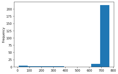
Most countries have more than 600 days of data, but some like Grand Princess, Niue, Costa Atlantica have less than 100 days of data.
Q2 Create a line chart that shows the total number of cases over time.
df_confirmed_case = df_covid_country_level[["date", "confirmed", "administrative_area_level_1"]].sort_values(["administrative_area_level_1", "date"]).rename(columns = {"confirmed" : "cum_confirmed", "administrative_area_level_1" : "country"})
df_confirmed_case["daily_confirmed"] = df_confirmed_case.groupby("country").cum_confirmed.diff().fillna(df_confirmed_case['cum_confirmed'])
df_confirmed_case = df_confirmed_case[["date", "country", "daily_confirmed", "cum_confirmed"]]
df_confirmed_case['year_month'] = df_confirmed_case['date'].dt.strftime('%Y-%m')
df_confirmed_case_monthly = df_confirmed_case[df_confirmed_case.daily_confirmed > 0].groupby("year_month").daily_confirmed.sum() \
                                .cumsum().reset_index().rename({"daily_confirmed" : "cum_confirmed"}, axis = 1) \
                                .merge(df_confirmed_case[df_confirmed_case.daily_confirmed > 0].groupby("year_month").daily_confirmed.sum(), on = "year_month", how = "left") \
                                .rename(columns = {"daily_confirmed" : "monthly_confirmed"})[["year_month", "monthly_confirmed", "cum_confirmed"]]
df_confirmed_case_monthly
| year_month | monthly_confirmed | cum_confirmed | |
|---|---|---|---|
| 0 | 2020-01 | 9863.0 | 9863.0 |
| 1 | 2020-02 | 76682.0 | 86545.0 |
| 2 | 2020-03 | 794611.0 | 881156.0 |
| 3 | 2020-04 | 2365557.0 | 3246713.0 |
| 4 | 2020-05 | 2901122.0 | 6147835.0 |
| 5 | 2020-06 | 4325821.0 | 10473656.0 |
| 6 | 2020-07 | 7163395.0 | 17637051.0 |
| 7 | 2020-08 | 7945496.0 | 25582547.0 |
| 8 | 2020-09 | 8590723.0 | 34173270.0 |
| 9 | 2020-10 | 12270240.0 | 46443510.0 |
| 10 | 2020-11 | 17166584.0 | 63610094.0 |
| 11 | 2020-12 | 20545820.0 | 84155914.0 |
| 12 | 2021-01 | 19477426.0 | 103633340.0 |
| 13 | 2021-02 | 11261962.0 | 114895302.0 |
| 14 | 2021-03 | 14932777.0 | 129828079.0 |
| 15 | 2021-04 | 22558324.0 | 152386403.0 |
| 16 | 2021-05 | 19702300.0 | 172088703.0 |
| 17 | 2021-06 | 14202707.0 | 186291410.0 |
| 18 | 2021-07 | 15836422.0 | 202127832.0 |
| 19 | 2021-08 | 20077425.0 | 222205257.0 |
| 20 | 2021-09 | 15994751.0 | 238200008.0 |
| 21 | 2021-10 | 12989702.0 | 251189710.0 |
| 22 | 2021-11 | 15805885.0 | 266995595.0 |
| 23 | 2021-12 | 25519483.0 | 292515078.0 |
| 24 | 2022-01 | 80602125.0 | 373117203.0 |
| 25 | 2022-02 | 12923794.0 | 386040997.0 |
fig, ax1 = plt.subplots(figsize = (30, 8))

# cumulative line chart
color = "tab:green"
ax1 = sns.lineplot(x = "year_month", y = "cum_confirmed", color = color, linewidth = 3, \
                   data = df_confirmed_case_monthly)
ax1.set_xlabel("Year-Month", fontsize = 16)
ax1.set_ylabel("Cumulative cases", color = color, fontsize = 16)

# monthly bar chart
ax2 = ax1.twinx()
color = "tab:blue"
ax2 = sns.barplot(x = "year_month", y = "monthly_confirmed", color = color, alpha = 0.5, \
                  data = df_confirmed_case_monthly)
ax2.set_ylabel("Monthly cases", color = color, fontsize = 16)
plt.show()
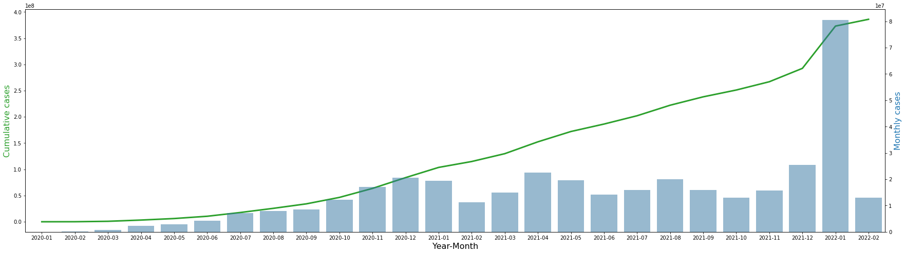
The table and graph above show the total number of confirmed cases by monthly and cumulatively. In January 2020, there were a total of 9863 cases, and it steadily increased, and in February of 22, there were approximately 380 million cases. The number of monthly cases steadily increased and then remained at around 15 to 20 million, and then surged to 80 million per month in January 2022.
Q3 Use the country-level data set to create a histogram to:
- Show the distribution of values for the number of hospitalizations per 1000 people.
- Draw a red vertical line that shows the median value on the histogram.
df_hospitalization = df_covid_country_level[["date", "hosp", "population", "administrative_area_level_1"]].dropna()
df_hospitalization = df_hospitalization[df_hospitalization.hosp > 0]
df_hospitalization["hosp/pop"] = df_hospitalization.hosp / df_hospitalization.population * 1000
df_hospitalization["hosp/pop"].describe()
count    28379.000000
mean         0.306831
std          5.254355
min          0.000024
25%          0.029287
50%          0.088823
75%          0.235695
max        239.165329
Name: hosp/pop, dtype: float64
75% of the data are below 0.23, while the maximum is 239. In other words, we think that there is an outlier on the large value side.
df_hospitalization.sort_values("hosp/pop", ascending = False).head(10)
| date | hosp | population | administrative_area_level_1 | hosp/pop | |
|---|---|---|---|---|---|
| 205 | 2020-05-07 | 149.0 | 623.0 | Costa Atlantica | 239.165329 |
| 203 | 2020-05-05 | 149.0 | 623.0 | Costa Atlantica | 239.165329 |
| 206 | 2020-05-08 | 149.0 | 623.0 | Costa Atlantica | 239.165329 |
| 204 | 2020-05-06 | 149.0 | 623.0 | Costa Atlantica | 239.165329 |
| 194 | 2020-04-26 | 148.0 | 623.0 | Costa Atlantica | 237.560193 |
| 195 | 2020-04-27 | 148.0 | 623.0 | Costa Atlantica | 237.560193 |
| 196 | 2020-04-28 | 148.0 | 623.0 | Costa Atlantica | 237.560193 |
| 197 | 2020-04-29 | 148.0 | 623.0 | Costa Atlantica | 237.560193 |
| 198 | 2020-04-30 | 148.0 | 623.0 | Costa Atlantica | 237.560193 |
| 199 | 2020-05-01 | 148.0 | 623.0 | Costa Atlantica | 237.560193 |
If you look at the cases where the number is abnormally large, you can see that it is a country called Costa Atlantica, and since the population is very small, 623, this large number comes out. Therefore, let’s look at only data up to 99.5 quantiles.
percentile_99 = np.percentile(df_hospitalization["hosp/pop"], 99.5)
percentile_99
1.4660090896687556
The 99.5% percentile of the number of hospitalizations per 1000 people is about 1.47.
hospital_median = df_hospitalization["hosp/pop"].median()
plt.figure(figsize = (30, 8))
sns.distplot(df_hospitalization[(df_hospitalization["hosp/pop"] <= percentile_99)]["hosp/pop"])
plt.axvline(x = hospital_median, color = "red")
plt.annotate(f'Median = {round(hospital_median, 4)}', xy=(hospital_median + 0.01, 8), fontsize = 15, color = "red")
plt.show()
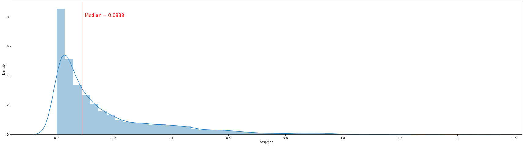
The histogram above shows the distribution of the number of hospitalizations per 1000 population excluding values above 99.5 percentile. More than half show a figure of 0.1 per 1000 population. The median number of hospitalizations per 1000 people is about 0.088.
Q4 Create a visualization that shows the number of tests per day in the United States and indicate the median value on your visualization.
US = df_covid_country_level[df_covid_country_level.administrative_area_level_1 == "United States"].sort_values("date")
US_test = US[["date", "tests"]].rename(columns = {"tests" : "cum_tests"})
US_test["daily_tests"] = US_test.cum_tests.diff().fillna(US_test['cum_tests'])
US_test = US_test[["date", "daily_tests", "cum_tests"]].dropna()
US_test["daily_tests_moving_avg"] = US_test.daily_tests.rolling(7).mean()
US_test
| date | daily_tests | cum_tests | daily_tests_moving_avg | |
|---|---|---|---|---|
| 159337 | 2020-03-01 | 348.0 | 348.0 | NaN |
| 159338 | 2020-03-02 | 514.0 | 862.0 | NaN |
| 159339 | 2020-03-03 | 622.0 | 1484.0 | NaN |
| 159340 | 2020-03-04 | 887.0 | 2371.0 | NaN |
| 159341 | 2020-03-05 | 1201.0 | 3572.0 | NaN |
| ... | ... | ... | ... | ... |
| 160035 | 2022-01-28 | 1725137.0 | 783594943.0 | 1.650536e+06 |
| 160036 | 2022-01-29 | 1121147.0 | 784716090.0 | 1.571547e+06 |
| 160037 | 2022-01-30 | 689304.0 | 785405394.0 | 1.514444e+06 |
| 160038 | 2022-01-31 | 1068185.0 | 786473579.0 | 1.460625e+06 |
| 160039 | 2022-02-01 | 1347217.0 | 787820796.0 | 1.397621e+06 |
703 rows × 4 columns
us_daily_test_median = US_test.daily_tests.median()
plt.figure(figsize = (30, 8))
sns.lineplot(x = "date", y = "daily_tests_moving_avg", color = "blue", linewidth = 2, \
             data = US_test)
sns.lineplot(x = "date", y = "daily_tests", color = "tab:blue", alpha = 0.3, \
             data = US_test)
plt.axhline(y = us_daily_test_median, color = "red")
plt.annotate(f'Median = {us_daily_test_median}', xy=(datestr2num("2020-03-01"), us_daily_test_median + 100000), fontsize = 15, color = "red")
plt.xlabel("Date", fontsize = 16)
plt.ylabel("The number of tests", fontsize = 16)
plt.show()
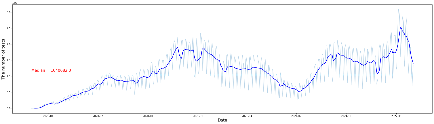
In the graph above, light blue is the number of tests per day, and dark blue is the smoothed graph of the light blue graph using the 7-day rolling average. We can check the overall trend by looking at the smoothed graph. It shows an increasing trend until January 2021 and then shows a decreasing trend until July 2021. And again, it shows an increasing trend from July 2021, then sharply increases on January 22, and has since decreased. The median number of tests per day in the United States is 1,040,682.
For questions below:
- You will have to call the covid19() function again with parameters specific to Canada.
- Set the parameter
level = 2in the call to covid19().
canada,src = covid19("CAN",level = 2)
We have invested a lot of time and effort in creating COVID-19 Data Hub, please cite the following when using it:
[1mGuidotti, E., Ardia, D., (2020), "COVID-19 Data Hub", Journal of Open Source Software 5(51):2376, doi: 10.21105/joss.02376.[0m
A BibTeX entry for LaTeX users is
@Article{,
title = {COVID-19 Data Hub},
year = {2020},
doi = {10.21105/joss.02376},
author = {Emanuele Guidotti and David Ardia},
journal = {Journal of Open Source Software},
volume = {5},
number = {51},
pages = {2376},
}
[33mTo hide this message use 'verbose = False'.[0m
canada.tail()
| id | date | confirmed | deaths | recovered | tests | vaccines | people_vaccinated | people_fully_vaccinated | hosp | ... | iso_alpha_3 | iso_alpha_2 | iso_numeric | iso_currency | key_local | key_google_mobility | key_apple_mobility | key_jhu_csse | key_nuts | key_gadm | |
|---|---|---|---|---|---|---|---|---|---|---|---|---|---|---|---|---|---|---|---|---|---|
| 496252 | eef40c88 | 2022-02-04 | 6550.0 | 17.0 | 5581.0 | 39811.0 | 96926.0 | NaN | NaN | NaN | ... | CAN | CA | 124.0 | CAD | 61 | ChIJDcHTs_Q4EVERjVnGRNguMhk | Northwest Territories | CANT | NaN | CAN.6_1 |
| 496253 | eef40c88 | 2022-02-05 | 6550.0 | 17.0 | 5581.0 | 39852.0 | 96926.0 | NaN | NaN | NaN | ... | CAN | CA | 124.0 | CAD | 61 | ChIJDcHTs_Q4EVERjVnGRNguMhk | Northwest Territories | CANT | NaN | CAN.6_1 |
| 496254 | eef40c88 | 2022-02-06 | 6550.0 | 17.0 | 5581.0 | 39852.0 | 96926.0 | NaN | NaN | NaN | ... | CAN | CA | 124.0 | CAD | 61 | ChIJDcHTs_Q4EVERjVnGRNguMhk | Northwest Territories | CANT | NaN | CAN.6_1 |
| 496255 | eef40c88 | 2022-02-07 | 6846.0 | 17.0 | 5925.0 | 39878.0 | 97798.0 | NaN | NaN | NaN | ... | CAN | CA | 124.0 | CAD | 61 | ChIJDcHTs_Q4EVERjVnGRNguMhk | Northwest Territories | CANT | NaN | CAN.6_1 |
| 496256 | eef40c88 | 2022-02-08 | NaN | NaN | NaN | NaN | 97798.0 | NaN | NaN | NaN | ... | CAN | CA | 124.0 | CAD | 61 | ChIJDcHTs_Q4EVERjVnGRNguMhk | Northwest Territories | CANT | NaN | CAN.6_1 |
5 rows × 47 columns
Q5 Create a bar plot to show the number of tests conducted in each province.
Order the provinces from west to east (use your best judgement for cases where the order is unclear). Which Canadian province that has conducted the most tests?
canada.columns
Index(['id', 'date', 'confirmed', 'deaths', 'recovered', 'tests', 'vaccines',
       'people_vaccinated', 'people_fully_vaccinated', 'hosp', 'icu', 'vent',
       'school_closing', 'workplace_closing', 'cancel_events',
       'gatherings_restrictions', 'transport_closing',
       'stay_home_restrictions', 'internal_movement_restrictions',
       'international_movement_restrictions', 'information_campaigns',
       'testing_policy', 'contact_tracing', 'facial_coverings',
       'vaccination_policy', 'elderly_people_protection',
       'government_response_index', 'stringency_index',
       'containment_health_index', 'economic_support_index',
       'administrative_area_level', 'administrative_area_level_1',
       'administrative_area_level_2', 'administrative_area_level_3',
       'latitude', 'longitude', 'population', 'iso_alpha_3', 'iso_alpha_2',
       'iso_numeric', 'iso_currency', 'key_local', 'key_google_mobility',
       'key_apple_mobility', 'key_jhu_csse', 'key_nuts', 'key_gadm'],
      dtype='object')
canada.administrative_area_level_2.unique()
array(['Prince Edward Island', 'Manitoba', 'Yukon', 'Nunavut', 'Ontario',
       'Quebec', 'Nova Scotia', 'British Columbia',
       'Newfoundland and Labrador', 'New Brunswick', 'Saskatchewan',
       'Alberta', 'Northwest Territories'], dtype=object)
canada_test_conducted = canada[["id", "date", "tests", "administrative_area_level_2", "latitude", "longitude", "population"]].rename(columns = {"administrative_area_level_2" : "province"})
canada_test_conducted.dropna(inplace = True)
canada_test_conducted.sort_values(["province","date"], ascending = [True, False])
| id | date | tests | province | latitude | longitude | population | |
|---|---|---|---|---|---|---|---|
| 475439 | e61d6191 | 2022-02-07 | 6763655.0 | Alberta | 54.500614 | -115.002842 | 4413146 |
| 475438 | e61d6191 | 2022-02-06 | 6746196.0 | Alberta | 54.500614 | -115.002842 | 4413146 |
| 475437 | e61d6191 | 2022-02-05 | 6746196.0 | Alberta | 54.500614 | -115.002842 | 4413146 |
| 475436 | e61d6191 | 2022-02-04 | 6746196.0 | Alberta | 54.500614 | -115.002842 | 4413146 |
| 475435 | e61d6191 | 2022-02-03 | 6739970.0 | Alberta | 54.500614 | -115.002842 | 4413146 |
| ... | ... | ... | ... | ... | ... | ... | ... |
| 124171 | 38791b01 | 2020-03-15 | 49.0 | Yukon | 64.819450 | -136.804579 | 41078 |
| 124170 | 38791b01 | 2020-03-14 | 37.0 | Yukon | 64.819450 | -136.804579 | 41078 |
| 124169 | 38791b01 | 2020-03-13 | 36.0 | Yukon | 64.819450 | -136.804579 | 41078 |
| 124168 | 38791b01 | 2020-03-12 | 34.0 | Yukon | 64.819450 | -136.804579 | 41078 |
| 124167 | 38791b01 | 2020-03-11 | 23.0 | Yukon | 64.819450 | -136.804579 | 41078 |
9128 rows × 7 columns
canada_test_conducted["date_order"] = canada_test_conducted.sort_values(["province","date"], ascending = [True, False]).groupby("province").cumcount() + 1
canada_test_conducted[canada_test_conducted.date_order == 1].sort_values(["longitude", "latitude"])
| id | date | tests | province | latitude | longitude | population | date_order | |
|---|---|---|---|---|---|---|---|---|
| 124865 | 38791b01 | 2022-02-07 | 9129.0 | Yukon | 64.819450 | -136.804579 | 41078 | 1 |
| 407259 | c229681f | 2022-02-07 | 5495428.0 | British Columbia | 54.499851 | -124.993506 | 5110917 | 1 |
| 496255 | eef40c88 | 2022-02-07 | 39878.0 | Northwest Territories | 65.280365 | -121.562220 | 44904 | 1 |
| 475439 | e61d6191 | 2022-02-07 | 6763655.0 | Alberta | 54.500614 | -115.002842 | 4413146 | 1 |
| 474047 | e4c07903 | 2022-02-07 | 1452358.0 | Saskatchewan | 54.500038 | -105.927063 | 1181666 | 1 |
| 264912 | 7fc88543 | 2022-02-07 | 32179.0 | Nunavut | 66.001041 | -100.263618 | 38780 | 1 |
| 99343 | 2a9fd65a | 2022-02-07 | 1434252.0 | Manitoba | 54.510344 | -97.212207 | 1377517 | 1 |
| 276313 | 83fc0fa9 | 2022-02-07 | 22606233.0 | Ontario | 49.269156 | -87.166464 | 14711827 | 1 |
| 347935 | a7ce33b9 | 2022-02-07 | 16015314.0 | Quebec | 53.889046 | -73.288937 | 8537674 | 1 |
| 443254 | d177e539 | 2022-02-07 | 704856.0 | New Brunswick | 46.551245 | -66.411970 | 779993 | 1 |
| 390749 | b91ff4d1 | 2022-02-07 | 1728364.0 | Nova Scotia | 44.727022 | -64.602949 | 977457 | 1 |
| 4180 | 015d95fc | 2022-02-07 | 255565.0 | Prince Edward Island | 46.503836 | -63.615584 | 158158 | 1 |
| 441298 | d07806cb | 2022-02-07 | 551866.0 | Newfoundland and Labrador | 49.120554 | -56.692576 | 521365 | 1 |
Since the test column is a cumulative number, if you check the data of the last date in each province, you can check the number of tests conducted in each province.
plt.figure(figsize = (30, 8))
sns.barplot(x = "province", y = "tests", \
            data = canada_test_conducted[canada_test_conducted.date_order == 1].sort_values(["longitude", "latitude"]))
plt.ylabel("The number of tests conducted")
plt.xlabel("Province")
plt.show()
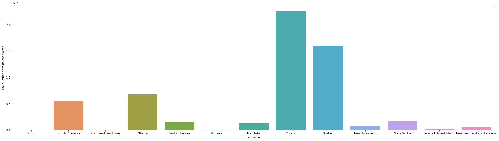
In the above bar chart, provinces are sorted in the order from west to east by sorting longitude first, and then latitude values. Looking at the bar chart above, it can be seen that Ontario and Quebec tested overwhelmingly, and there were more tests in the west than in the east. However, since this is an interpretation that does not take into account the population of each province, it is necessary to consider the population as well.
Q6 Create a bar plot that shows the number of tests conducted per 1000 people for each province in Canada.
How would you interpret the results of this bar plot given the results of bar plot in question 5.
canada_test_conducted.loc[canada_test_conducted.date_order == 1, "tests/pop"] = canada_test_conducted[canada_test_conducted.date_order == 1].tests \
                                                                            / canada_test_conducted[canada_test_conducted.date_order == 1].population \
                                                                            * 1000
canada_test_conducted[canada_test_conducted.date_order == 1].sort_values(["longitude", "latitude"])
| id | date | tests | province | latitude | longitude | population | date_order | tests/pop | |
|---|---|---|---|---|---|---|---|---|---|
| 124865 | 38791b01 | 2022-02-07 | 9129.0 | Yukon | 64.819450 | -136.804579 | 41078 | 1 | 222.235747 |
| 407259 | c229681f | 2022-02-07 | 5495428.0 | British Columbia | 54.499851 | -124.993506 | 5110917 | 1 | 1075.233270 |
| 496255 | eef40c88 | 2022-02-07 | 39878.0 | Northwest Territories | 65.280365 | -121.562220 | 44904 | 1 | 888.072332 |
| 475439 | e61d6191 | 2022-02-07 | 6763655.0 | Alberta | 54.500614 | -115.002842 | 4413146 | 1 | 1532.615282 |
| 474047 | e4c07903 | 2022-02-07 | 1452358.0 | Saskatchewan | 54.500038 | -105.927063 | 1181666 | 1 | 1229.076575 |
| 264912 | 7fc88543 | 2022-02-07 | 32179.0 | Nunavut | 66.001041 | -100.263618 | 38780 | 1 | 829.783394 |
| 99343 | 2a9fd65a | 2022-02-07 | 1434252.0 | Manitoba | 54.510344 | -97.212207 | 1377517 | 1 | 1041.186425 |
| 276313 | 83fc0fa9 | 2022-02-07 | 22606233.0 | Ontario | 49.269156 | -87.166464 | 14711827 | 1 | 1536.602694 |
| 347935 | a7ce33b9 | 2022-02-07 | 16015314.0 | Quebec | 53.889046 | -73.288937 | 8537674 | 1 | 1875.840422 |
| 443254 | d177e539 | 2022-02-07 | 704856.0 | New Brunswick | 46.551245 | -66.411970 | 779993 | 1 | 903.669648 |
| 390749 | b91ff4d1 | 2022-02-07 | 1728364.0 | Nova Scotia | 44.727022 | -64.602949 | 977457 | 1 | 1768.225098 |
| 4180 | 015d95fc | 2022-02-07 | 255565.0 | Prince Edward Island | 46.503836 | -63.615584 | 158158 | 1 | 1615.884116 |
| 441298 | d07806cb | 2022-02-07 | 551866.0 | Newfoundland and Labrador | 49.120554 | -56.692576 | 521365 | 1 | 1058.502201 |
plt.figure(figsize = (30, 8))
sns.barplot(x = "province", y = "tests/pop", \
            data = canada_test_conducted[canada_test_conducted.date_order == 1].sort_values(["longitude", "latitude"]))
plt.ylabel("The number of tests conducted pero 1000 people")
plt.xlabel("Province")
plt.show()
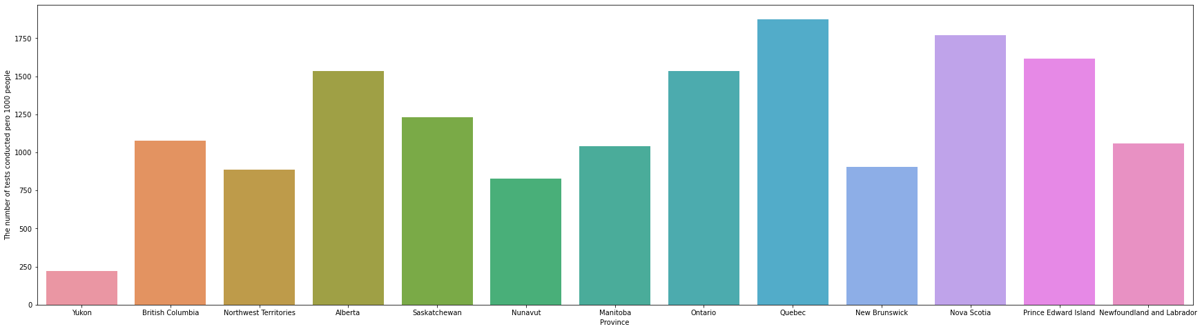
In the graph in Q5, it came out that Ontario and Quebec had an overwhelming number of tests, but if you check the graph in Q6, you can confirm that this was because the population of the two provinces was overwhelmingly large. Comparing the number of tests per 1000 population, it can be seen that Ontario is lower than Nova Scotia and Prince Edward Island. In addition, it can be seen that the number of tests per 1000 population is slightly higher in the east than in the west.
Q7 Create a visualization that shows which Canadian province has the highest recovery rate.
Recovery rate is calculated as the number of recovered cases divided by the number of confirmed cases.
canada_recovery = canada[["id", "date", "confirmed", "recovered", "administrative_area_level_2", "latitude", "longitude"]].rename(columns = {"administrative_area_level_2" : "province"})
canada_recovery.dropna(inplace = True)
canada_recovery["date_order"] = canada_recovery.sort_values(["province","date"], ascending = [True, False]).groupby("province").cumcount() + 1
canada_recovery.loc[canada_recovery.date_order == 1, "recovery_rate"] = canada_recovery[canada_recovery.date_order == 1].recovered \
                                                                            / canada_recovery[canada_recovery.date_order == 1].confirmed
canada_recovery.loc[canada_recovery.date_order == 1].sort_values("recovery_rate", ascending = False)
| id | date | confirmed | recovered | province | latitude | longitude | date_order | recovery_rate | |
|---|---|---|---|---|---|---|---|---|---|
| 124865 | 38791b01 | 2022-02-07 | 3235.0 | 3105.0 | Yukon | 64.819450 | -136.804579 | 1 | 0.959815 |
| 276313 | 83fc0fa9 | 2022-02-07 | 1056149.0 | 1010878.0 | Ontario | 49.269156 | -87.166464 | 1 | 0.957136 |
| 347935 | a7ce33b9 | 2022-02-07 | 883192.0 | 834633.0 | Quebec | 53.889046 | -73.288937 | 1 | 0.945019 |
| 475439 | e61d6191 | 2022-02-07 | 508051.0 | 474284.0 | Alberta | 54.500614 | -115.002842 | 1 | 0.933536 |
| 407259 | c229681f | 2022-02-07 | 333925.0 | 306419.0 | British Columbia | 54.499851 | -124.993506 | 1 | 0.917628 |
| 474047 | e4c07903 | 2022-02-07 | 123258.0 | 113023.0 | Saskatchewan | 54.500038 | -105.927063 | 1 | 0.916963 |
| 441298 | d07806cb | 2022-02-07 | 18740.0 | 17156.0 | Newfoundland and Labrador | 49.120554 | -56.692576 | 1 | 0.915475 |
| 390749 | b91ff4d1 | 2022-02-07 | 40767.0 | 37300.0 | Nova Scotia | 44.727022 | -64.602949 | 1 | 0.914956 |
| 443254 | d177e539 | 2022-02-07 | 31017.0 | 27298.0 | New Brunswick | 46.551245 | -66.411970 | 1 | 0.880098 |
| 496255 | eef40c88 | 2022-02-07 | 6846.0 | 5925.0 | Northwest Territories | 65.280365 | -121.562220 | 1 | 0.865469 |
| 99343 | 2a9fd65a | 2022-02-07 | 123739.0 | 103595.0 | Manitoba | 54.510344 | -97.212207 | 1 | 0.837206 |
| 4180 | 015d95fc | 2022-02-07 | 9104.0 | 7268.0 | Prince Edward Island | 46.503836 | -63.615584 | 1 | 0.798330 |
| 264912 | 7fc88543 | 2022-02-07 | 1989.0 | 1444.0 | Nunavut | 66.001041 | -100.263618 | 1 | 0.725993 |
plt.figure(figsize = (30, 8))
sns.barplot(x = "province", y = "recovery_rate", \
            data = canada_recovery[canada_recovery.date_order == 1].sort_values(["longitude", "latitude"]))
plt.ylabel("Recovery rate = # of recovered cases / # of confirmed cases")
plt.xlabel("Province")
plt.show()
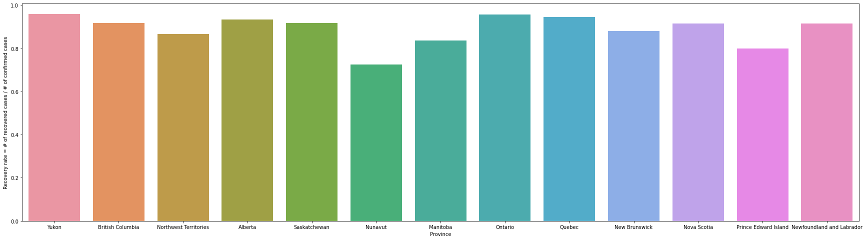
Yukon has the highest recovery rate of 0.96, Nunavut has the lowest 0.73. Yukon had the lowest number of tests per 1000 population but the highest recovery rate. In Nunavut, the number of tests per 1000 people was 829, which was much lower than in other provinces, but the recovery rate was also the lowest.
Q8 Create visualizations that show the impacts of _at least_ three policy measures on mortality or infection rates.
See https://covid19datahub.io/articles/doc/data.html for descriptions of the available policy measures. You are not limited to histograms and bar charts. Remember that you can use subplots!
Gatherings restrictions
0 - no restrictions
1 - restrictions on very large gatherings (the limit is above 1000 people)
2 - restrictions on gatherings between 101-1000 people
3 - restrictions on gatherings between 11-100 people
4 - restrictions on gatherings of 10 people or less
If gathering restrictions are targeted to a specific geographical region, then they have a negative value. Otherwise, if they are a general policy that is applied across the whole country/territory, then they have positive values. Since I am only interested in the impacts of the general policy on infection rates, I will focus on the data that have the positive gathering_restirctions values.
canada_gatherings_restriction = canada[["date", "confirmed", "population", "gatherings_restrictions", "administrative_area_level_2"]].rename(columns = {"administrative_area_level_2" : "province", "confirmed" : "cum_confirmed"})
canada_gatherings_restriction = canada_gatherings_restriction[canada_gatherings_restriction.cum_confirmed.isnull() == False]
canada_gatherings_restriction = canada_gatherings_restriction[canada_gatherings_restriction.gatherings_restrictions >= 0].sort_values(["province", "date"])
canada_gatherings_restriction["daily_confirmed"] = canada_gatherings_restriction.sort_values(["province", "date"]).groupby("province").cum_confirmed.diff().fillna(canada_gatherings_restriction.cum_confirmed)
canada_gatherings_restriction = canada_gatherings_restriction[canada_gatherings_restriction.daily_confirmed >= 0]
canada_gatherings_restriction = canada_gatherings_restriction[["date", "province", "population", "gatherings_restrictions", "daily_confirmed", "cum_confirmed"]]
canada_gatherings_restriction_infection_rate = canada_gatherings_restriction.groupby(["gatherings_restrictions", "date"]).sum()[["daily_confirmed", "population"]].reset_index()
canada_gatherings_restriction_infection_rate["infection_rate"] = canada_gatherings_restriction_infection_rate.daily_confirmed / canada_gatherings_restriction_infection_rate.population * 100
canada_gatherings_restriction_infection_rate
| gatherings_restrictions | date | daily_confirmed | population | infection_rate | |
|---|---|---|---|---|---|
| 0 | 0.0 | 2020-01-31 | 4.0 | 19822744 | 0.000020 |
| 1 | 0.0 | 2020-02-08 | 3.0 | 19822744 | 0.000015 |
| 2 | 0.0 | 2020-02-16 | 1.0 | 19822744 | 0.000005 |
| 3 | 0.0 | 2020-02-21 | 1.0 | 19822744 | 0.000005 |
| 4 | 0.0 | 2020-02-24 | 1.0 | 19822744 | 0.000005 |
| ... | ... | ... | ... | ... | ... |
| 1854 | 4.0 | 2022-01-31 | 2073.0 | 4499128 | 0.046076 |
| 1855 | 4.0 | 2022-02-01 | 2188.0 | 4458050 | 0.049080 |
| 1856 | 4.0 | 2022-02-02 | 3172.0 | 4458050 | 0.071152 |
| 1857 | 4.0 | 2022-02-03 | 2512.0 | 4458050 | 0.056348 |
| 1858 | 4.0 | 2022-02-04 | 2273.0 | 4458050 | 0.050986 |
1859 rows × 5 columns
plt.figure(figsize = (20, 8))
sns.boxplot(data = canada_gatherings_restriction_infection_rate, x = "gatherings_restrictions", y = "infection_rate", showfliers = False)
plt.xlabel("Gathering restrictions", fontsize = 16)
plt.ylabel("Infection rate (%) = confirmed cases / population * 100", fontsize = 16)
plt.show()
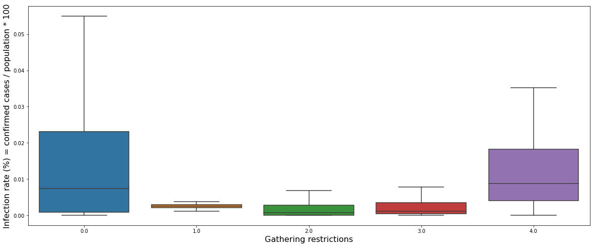
The graph above shows a box plot of the daily infection rate for each gathering restriction policy. It can be seen that the infection rate was high when there was no restriction, but when the restriction was level 1 to 3, the infection rate was significantly reduced. However, when the restriction was the highest at level 4, the infection rate was rather high.
canada_gatherings_restriction_infection_rate["infection_rate_moving_avg"] = canada_gatherings_restriction_infection_rate.sort_values(["gatherings_restrictions","date"]).groupby("gatherings_restrictions").infection_rate.rolling(7).mean().reset_index().infection_rate
plt.figure(figsize = (30, 8))
sns.lineplot(data = canada_gatherings_restriction_infection_rate, x = "date", y = "infection_rate_moving_avg", hue = "gatherings_restrictions")
plt.xlabel("date", fontsize = 16)
plt.ylabel("Infection rate (%) = confirmed cases / population * 100", fontsize = 16)
plt.show()
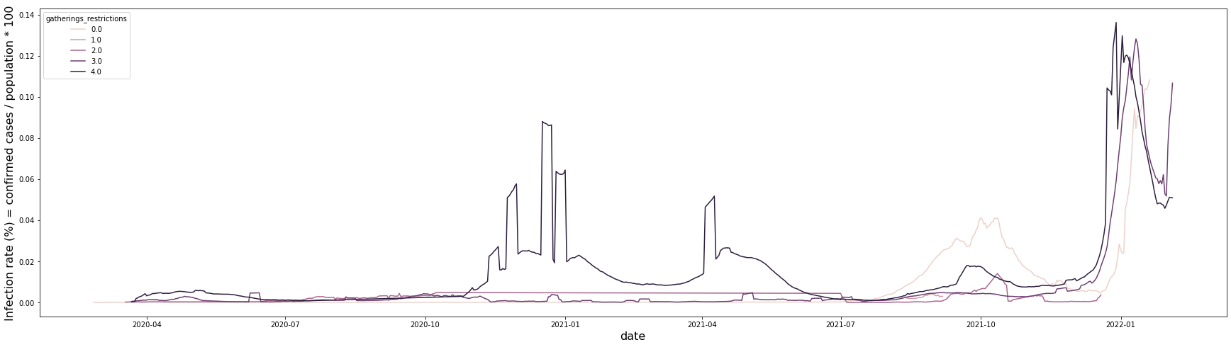
It is a graph showing the infection rate for each restriction level over time. All five levels show a similar trend, but it can be seen that the infection rate is particularly high in the 4th level of restriction area from October 2020 to June 2021. In addition, the infection rate was particularly high in the level 0 restricted area from July 2021 to December 2021.
Stay home restrictions
0 - no measures
1 - recommend not leaving house
2 - require not leaving house with exceptions for daily exercise, grocery shopping, and ‘essential’ trips
3 - require not leaving house with minimal exceptions (eg allowed to leave once a week, or only one person can leave at a time, etc)
If stay-home restrictions are targeted to a specific geographical region, then they have a negative value. Otherwise, if they are a general policy that is applied across the whole country/territory, then they have positive values. Since I am only interested in the impacts of the general policy on infection rates, I will focus on the data that have positive stay-home restrictions values.
canada_stayhome_restriction = canada[["date", "confirmed", "population", "stay_home_restrictions", "administrative_area_level_2"]].rename(columns = {"administrative_area_level_2" : "province", "confirmed" : "cum_confirmed"})
canada_stayhome_restriction = canada_stayhome_restriction[canada_stayhome_restriction.cum_confirmed.isnull() == False]
canada_stayhome_restriction = canada_stayhome_restriction[canada_stayhome_restriction.stay_home_restrictions >= 0].sort_values(["province", "date"])
canada_stayhome_restriction["daily_confirmed"] = canada_stayhome_restriction.sort_values(["province", "date"]).groupby("province").cum_confirmed.diff().fillna(canada_stayhome_restriction.cum_confirmed)
canada_stayhome_restriction = canada_stayhome_restriction[canada_stayhome_restriction.daily_confirmed >= 0]
canada_stayhome_restriction = canada_stayhome_restriction[["date", "province", "population", "stay_home_restrictions", "daily_confirmed", "cum_confirmed"]]
canada_stayhome_restriction_infection_rate = canada_stayhome_restriction.groupby(["stay_home_restrictions", "date"]).sum()[["daily_confirmed", "population"]].reset_index()
canada_stayhome_restriction_infection_rate["infection_rate"] = canada_stayhome_restriction_infection_rate.daily_confirmed / canada_stayhome_restriction_infection_rate.population * 100
canada_stayhome_restriction_infection_rate
| stay_home_restrictions | date | daily_confirmed | population | infection_rate | |
|---|---|---|---|---|---|
| 0 | 0.0 | 2020-01-31 | 4.0 | 19822744 | 0.000020 |
| 1 | 0.0 | 2020-02-08 | 3.0 | 19822744 | 0.000015 |
| 2 | 0.0 | 2020-02-16 | 1.0 | 19822744 | 0.000005 |
| 3 | 0.0 | 2020-02-21 | 1.0 | 19822744 | 0.000005 |
| 4 | 0.0 | 2020-02-24 | 1.0 | 19822744 | 0.000005 |
| ... | ... | ... | ... | ... | ... |
| 1389 | 2.0 | 2022-01-12 | 8351.0 | 8537674 | 0.097814 |
| 1390 | 2.0 | 2022-01-13 | 8793.0 | 8537674 | 0.102991 |
| 1391 | 2.0 | 2022-01-14 | 7382.0 | 8537674 | 0.086464 |
| 1392 | 2.0 | 2022-01-15 | 6705.0 | 8537674 | 0.078534 |
| 1393 | 2.0 | 2022-01-16 | 5946.0 | 8537674 | 0.069644 |
1394 rows × 5 columns
plt.figure(figsize = (20, 8))
sns.boxplot(data = canada_stayhome_restriction_infection_rate, x = "stay_home_restrictions", y = "infection_rate", showfliers = False)
plt.xlabel("Stay home restrictions", fontsize = 16)
plt.ylabel("Infection rate (%) = confirmed cases / population * 100", fontsize = 16)
plt.show()
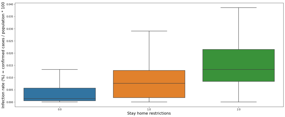
The graph above shows a box plot of the daily infection rate for each stay-home restriction. Contrary to our common sense, it can be seen that the higher the restriction level, the higher the infection rate.
canada_stayhome_restriction_infection_rate["infection_rate_moving_avg"] = canada_stayhome_restriction_infection_rate.sort_values(["stay_home_restrictions","date"]).groupby("stay_home_restrictions").infection_rate.rolling(7).mean().reset_index().infection_rate
plt.figure(figsize = (30, 8))
sns.lineplot(data = canada_stayhome_restriction_infection_rate, x = "date", y = "infection_rate_moving_avg", hue = "stay_home_restrictions")
plt.xlabel("date", fontsize = 16)
plt.ylabel("Infection rate (%) = confirmed cases / population * 100", fontsize = 16)
plt.show()
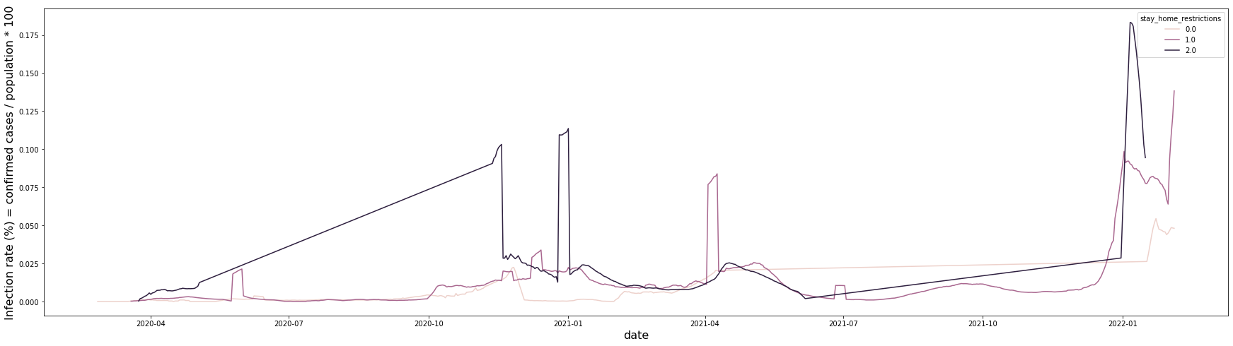
The overall trend is similar, but in the case of the second-stage restriction, it can be seen that the infection rate was particularly high from April 2020 to January 2021.
Transport closing
0 - no measures
1 - recommend closing (or significantly reduce volume/route/means of transport available)
2 - require closing (or prohibit most citizens from using it)
If transport closing restrictions are targeted to a specific geographical region, then they have a negative value. Otherwise, if they are a general policy that is applied across the whole country/territory, then they have positive values. Since I am only interested in the impacts of the general policy on infection rates, I will focus on the data that have positive transport closing values.
canada_transport_closing = canada[["date", "confirmed", "population", "transport_closing", "administrative_area_level_2"]].rename(columns = {"administrative_area_level_2" : "province", "confirmed" : "cum_confirmed"})
canada_transport_closing = canada_transport_closing[canada_transport_closing.cum_confirmed.isnull() == False]
canada_transport_closing = canada_transport_closing[canada_transport_closing.transport_closing >= 0].sort_values(["province", "date"])
canada_transport_closing["daily_confirmed"] = canada_transport_closing.sort_values(["province", "date"]).groupby("province").cum_confirmed.diff().fillna(canada_transport_closing.cum_confirmed)
canada_transport_closing = canada_transport_closing[canada_transport_closing.daily_confirmed >= 0]
canada_transport_closing = canada_transport_closing[["date", "province", "population", "transport_closing", "daily_confirmed", "cum_confirmed"]]
canada_transport_closing_infection_rate = canada_transport_closing.groupby(["transport_closing", "date"]).sum()[["daily_confirmed", "population"]].reset_index()
canada_transport_closing_infection_rate["infection_rate"] = canada_transport_closing_infection_rate.daily_confirmed / canada_transport_closing_infection_rate.population * 100
canada_transport_closing_infection_rate
| transport_closing | date | daily_confirmed | population | infection_rate | |
|---|---|---|---|---|---|
| 0 | 0.0 | 2020-01-31 | 4.0 | 19822744 | 0.000020 |
| 1 | 0.0 | 2020-02-08 | 3.0 | 19822744 | 0.000015 |
| 2 | 0.0 | 2020-02-16 | 1.0 | 19822744 | 0.000005 |
| 3 | 0.0 | 2020-02-21 | 1.0 | 19822744 | 0.000005 |
| 4 | 0.0 | 2020-02-24 | 1.0 | 19822744 | 0.000005 |
| ... | ... | ... | ... | ... | ... |
| 1256 | 1.0 | 2022-01-27 | 378.0 | 521365 | 0.072502 |
| 1257 | 1.0 | 2022-01-28 | 265.0 | 521365 | 0.050828 |
| 1258 | 1.0 | 2022-01-29 | 208.0 | 521365 | 0.039895 |
| 1259 | 1.0 | 2022-01-30 | 210.0 | 521365 | 0.040279 |
| 1260 | 1.0 | 2022-01-31 | 183.0 | 521365 | 0.035100 |
1261 rows × 5 columns
plt.figure(figsize = (20, 8))
sns.boxplot(data = canada_transport_closing_infection_rate, x = "transport_closing", y = "infection_rate", showfliers = False)
plt.xlabel("Transport closing", fontsize = 16)
plt.ylabel("Infection rate (%) = confirmed cases / population * 100", fontsize = 16)
plt.show()
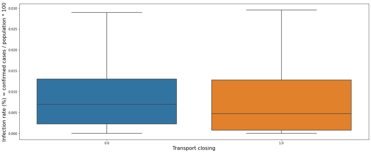
The graph above shows a box plot of the daily infection rate for each transport closing restriction. There was no level 2 restriction in Canada. It can be seen that the first level restriction, which only recommends transport closing, has little effect on the infection rate.
canada_transport_closing_infection_rate["infection_rate_moving_avg"] = canada_transport_closing_infection_rate.sort_values(["transport_closing","date"]).groupby("transport_closing").infection_rate.rolling(7).mean().reset_index().infection_rate
plt.figure(figsize = (30, 8))
sns.lineplot(data = canada_transport_closing_infection_rate, x = "date", y = "infection_rate_moving_avg", hue = "transport_closing")
plt.xlabel("date", fontsize = 16)
plt.ylabel("Infection rate (%) = confirmed cases / population * 100", fontsize = 16)
plt.show()
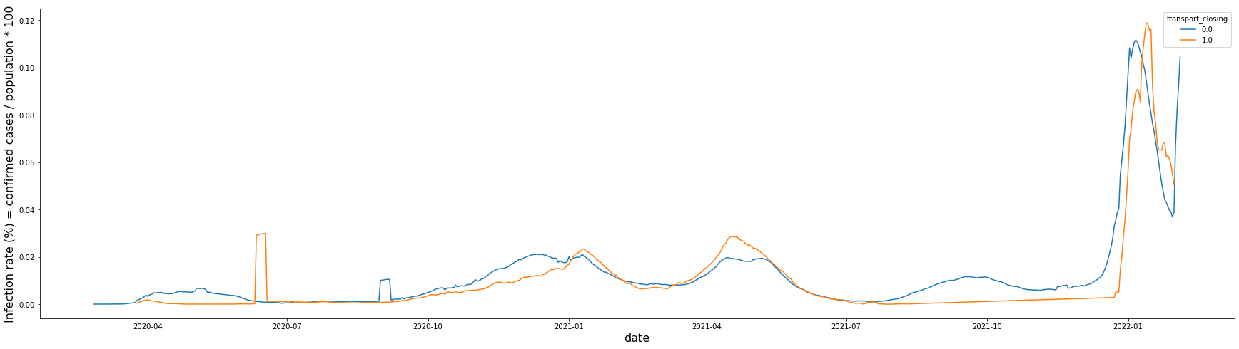
Level 0 and Level 1 restrictions show almost no difference in the infection rate over time.