
HW4. Visualization, Correlation, and Linear Models
Topics: Data visualization, Correlation, Linear models
import numpy as np
import pandas as pd
import seaborn as sns
import matplotlib.pyplot as plt
import warnings
from scipy import stats
import statsmodels.api as sm
import statsmodels.formula.api as smf
from statsmodels.stats.multicomp import pairwise_tukeyhsd
import matplotlib.patches as mpatches
warnings.filterwarnings('ignore')
MY_UNIQNAME = 'yjwoo'
We will be using two different datasets for the two different parts of this homework. Download the data from:
YouTube provides a list of trending videos on it’s site, determined by user interaction metrics such as likes, comments, and views. This dataset includes months of daily trending video across five different regions: the United States (“US”), Canada (“CA”), Great Britain (“GB”), Germany (“DE”), and France (“FR”).
- https://www.kaggle.com/abcsds/pokemon
This data set includes 721 Pokemon, including their number, name, first and second type, and basic stats: HP, Attack, Defense, Special Attack, Special Defense, and Speed.
Part 1: Answer the questions below based on the YouTube dataset
- Write Python code that can answer the following questions, and
- Explain your answers in plain English.
Q1. For 15 Points: Compare the distributions of comments, views, likes, and dislikes for
- Plot histograms for these metrics for Canada. What can you say about them?
- Try to apply a log transformation, and plot the histograms again. How do they look now?
- Create a pairplot for Canada, as we did in this week’s class. Do you see anything interesting?
- Create additional pairplots for the other four regions. Do they look similar?
df_youtube_canada = pd.read_csv("./data/CAvideos.csv")
df_youtube_canada.head()
| video_id | trending_date | title | channel_title | category_id | publish_time | tags | views | likes | dislikes | comment_count | thumbnail_link | comments_disabled | ratings_disabled | video_error_or_removed | description | |
|---|---|---|---|---|---|---|---|---|---|---|---|---|---|---|---|---|
| 0 | n1WpP7iowLc | 17.14.11 | Eminem - Walk On Water (Audio) ft. Beyoncé | EminemVEVO | 10 | 2017-11-10T17:00:03.000Z | Eminem|"Walk"|"On"|"Water"|"Aftermath/Shady/In... | 17158579 | 787425 | 43420 | 125882 | https://i.ytimg.com/vi/n1WpP7iowLc/default.jpg | False | False | False | Eminem's new track Walk on Water ft. Beyoncé i... |
| 1 | 0dBIkQ4Mz1M | 17.14.11 | PLUSH - Bad Unboxing Fan Mail | iDubbbzTV | 23 | 2017-11-13T17:00:00.000Z | plush|"bad unboxing"|"unboxing"|"fan mail"|"id... | 1014651 | 127794 | 1688 | 13030 | https://i.ytimg.com/vi/0dBIkQ4Mz1M/default.jpg | False | False | False | STill got a lot of packages. Probably will las... |
| 2 | 5qpjK5DgCt4 | 17.14.11 | Racist Superman | Rudy Mancuso, King Bach & Le... | Rudy Mancuso | 23 | 2017-11-12T19:05:24.000Z | racist superman|"rudy"|"mancuso"|"king"|"bach"... | 3191434 | 146035 | 5339 | 8181 | https://i.ytimg.com/vi/5qpjK5DgCt4/default.jpg | False | False | False | WATCH MY PREVIOUS VIDEO ▶ \n\nSUBSCRIBE ► http... |
| 3 | d380meD0W0M | 17.14.11 | I Dare You: GOING BALD!? | nigahiga | 24 | 2017-11-12T18:01:41.000Z | ryan|"higa"|"higatv"|"nigahiga"|"i dare you"|"... | 2095828 | 132239 | 1989 | 17518 | https://i.ytimg.com/vi/d380meD0W0M/default.jpg | False | False | False | I know it's been a while since we did this sho... |
| 4 | 2Vv-BfVoq4g | 17.14.11 | Ed Sheeran - Perfect (Official Music Video) | Ed Sheeran | 10 | 2017-11-09T11:04:14.000Z | edsheeran|"ed sheeran"|"acoustic"|"live"|"cove... | 33523622 | 1634130 | 21082 | 85067 | https://i.ytimg.com/vi/2Vv-BfVoq4g/default.jpg | False | False | False | 🎧: https://ad.gt/yt-perfect\n💰: https://atlant... |
df_youtube_canada.shape
(40881, 16)
The youtube_canada data consists of a total of 40881 rows and 16 columns.
df_youtube_canada.info()
<class 'pandas.core.frame.DataFrame'>
RangeIndex: 40881 entries, 0 to 40880
Data columns (total 16 columns):
 #   Column                  Non-Null Count  Dtype
---  ------                  --------------  -----
 0   video_id                40881 non-null  object
 1   trending_date           40881 non-null  object
 2   title                   40881 non-null  object
 3   channel_title           40881 non-null  object
 4   category_id             40881 non-null  int64
 5   publish_time            40881 non-null  object
 6   tags                    40881 non-null  object
 7   views                   40881 non-null  int64
 8   likes                   40881 non-null  int64
 9   dislikes                40881 non-null  int64
 10  comment_count           40881 non-null  int64
 11  thumbnail_link          40881 non-null  object
 12  comments_disabled       40881 non-null  bool
 13  ratings_disabled        40881 non-null  bool
 14  video_error_or_removed  40881 non-null  bool
 15  description             39585 non-null  object
dtypes: bool(3), int64(5), object(8)
memory usage: 4.2+ MB
You can check that there are no missing values except for the description column.
Views
df_youtube_canada["views"].describe()
count    4.088100e+04
mean     1.147036e+06
std      3.390913e+06
min      7.330000e+02
25%      1.439020e+05
50%      3.712040e+05
75%      9.633020e+05
max      1.378431e+08
Name: views, dtype: float64
sns.set(style = "darkgrid")
plt.figure(figsize = (8, 7))

sns.histplot(x = df_youtube_canada["views"])
plt.xlabel("Views", fontsize = 16)
plt.ylabel("Count", fontsize = 16)

plt.show()
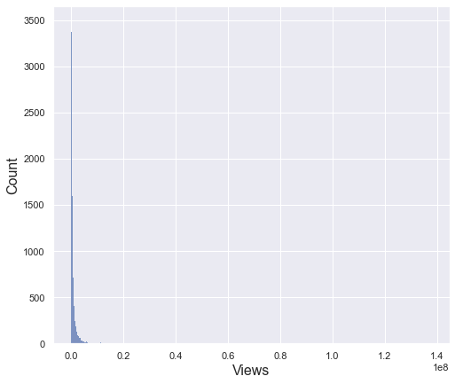
The view column has a very large deviation with a minimum value of 733 and a maximum value of 130 million. Therefore, the standard deviation is also very large of 3.3 million. For this reason, even if you draw a histogram, you cannot check the distribution properly as above. To see the distribution in more detail, let’s check only the data within the 95% percentile
percentile_95_views = np.percentile(df_youtube_canada["views"], 95)
percentile_95_views
4090835.0
95% percentile of views column is about 4 million
sns.set(style="darkgrid")

fig, (ax_box, ax_hist) = plt.subplots(2, sharex = True, gridspec_kw = {"height_ratios": (.2, .8)}, figsize = (10, 7))

sns.boxplot(x = df_youtube_canada.views, ax = ax_box, showfliers = False)
sns.histplot(x = df_youtube_canada[df_youtube_canada["views"] <= percentile_95_views].views, ax = ax_hist)

plt.xlabel("Views", fontsize = 16)
plt.ylabel("Count", fontsize = 16)
ax_box.set_xlabel("")

plt.show()
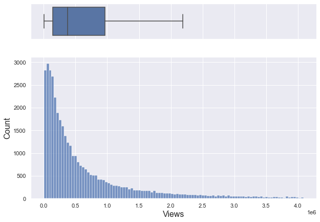
If you only look at data below 95% percentile, it is a right-skewed graph with a median of about 370,000.
np.log(df_youtube_canada["views"]).describe()
count    40881.000000
mean        12.810707
std          1.508807
min          6.597146
25%         11.876888
50%         12.824507
75%         13.778122
max         18.741627
Name: views, dtype: float64
sns.set(style="darkgrid")
plt.figure(figsize = (8, 7))

sns.histplot(x = np.log(df_youtube_canada["views"]))
plt.xlabel("Views", fontsize = 16)
plt.ylabel("Count", fontsize = 16)

plt.show()
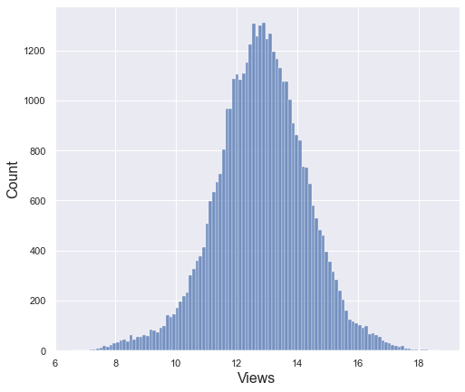
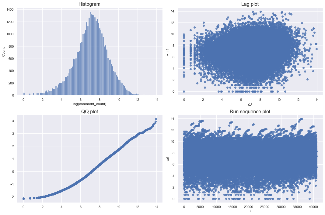
After log transformation, it seems to follow a normal distribution with some bell shape. However, since it is not possible to judge only by the shape of histogram, let’s check the lag plot, QQplot, and run sequence plot together.
def checkPlots(data, column, isLogTransform):

    if isLogTransform:
        series = np.log(data[column])

    else:
        series = data[column]

    fig, axs = plt.subplots(2, 2, figsize = (15, 10))
    plt.tight_layout(pad = 0.4, w_pad = 4, h_pad = 1.0)

    # Histogram
    ax = sns.histplot(series, ax = axs[0, 0])
    if isLogTransform:
        ax.set_xlabel(f"log({column})", fontsize = 12)
        ax.set_title("Histogram", fontsize = 16)
    else:
        ax.set_xlabel(column, fontsize = 12)
    ax.set_ylabel("Count", fontsize = 12)
    ax.set_title("Histogram", fontsize = 16)

    # Lag plot
    lag = series.copy()
    lag = np.array(lag[:-1])
    current = series[1:]
    ax = sns.regplot(x = current, y = lag, fit_reg = False, ax = axs[0,1])
    ax.set_ylabel("y_i-1", fontsize = 12)
    ax.set_xlabel("y_i", fontsize = 12)
    ax.set_title("Lag plot", fontsize = 16)

    # QQ plot
    qntls, xr = stats.probplot(series, fit=False)
    ax = sns.regplot(x = xr, y = qntls, ax = axs[1,0])
    ax.set_title("QQ plot", fontsize = 16)

    # Run sequence
    ax = sns.regplot(x = np.arange(len(series)),y = series, ax = axs[1,1])
    ax.set_ylabel("val", fontsize = 12)
    ax.set_xlabel("i", fontsize = 12)
    ax.set_title("Run sequence plot", fontsize = 16)

    plt.tight_layout()
    plt.show()
checkPlots(data = df_youtube_canada, column = "views", isLogTransform = True)
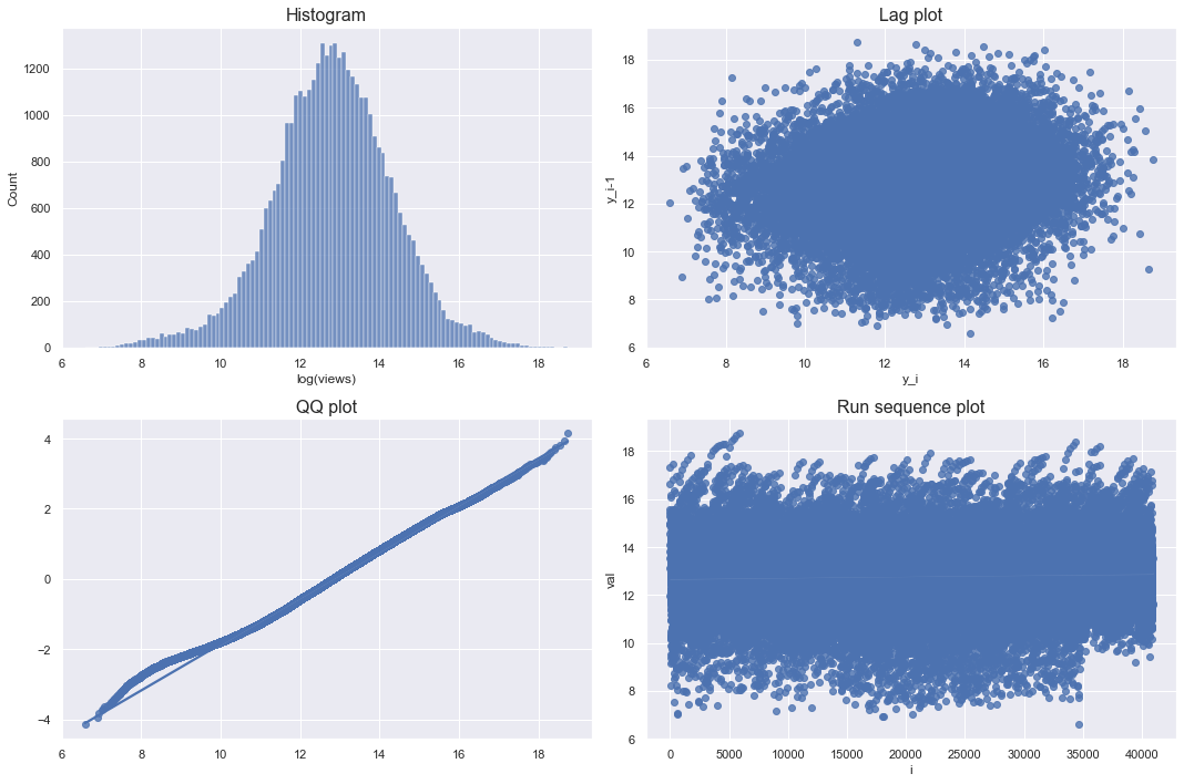
The lag plot and run sequence plot should not show a certain pattern, and the qq plot means that the more points on the diagonal, the closer to the bell shape. Since the log transformation of views satisfies all of these conditions, it can be seen that it is close to a normal distribution.
Likes
df_youtube_canada["likes"].describe()
count    4.088100e+04
mean     3.958269e+04
std      1.326895e+05
min      0.000000e+00
25%      2.191000e+03
50%      8.780000e+03
75%      2.871700e+04
max      5.053338e+06
Name: likes, dtype: float64
sns.set(style="darkgrid")
plt.figure(figsize = (8, 7))

sns.histplot(x = df_youtube_canada["likes"])
plt.xlabel("Likes", fontsize = 16)
plt.ylabel("Count", fontsize = 16)

plt.show()
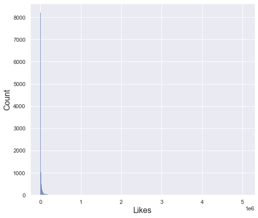
The likes column has a very large deviation with a minimum value of 0 and a maximum value of 5 million. Therefore, the standard deviation is also very large of one hundred thirty-five thousand. For this reason, even if you draw a histogram, you cannot check the distribution properly as above. To see the distribution in more detail, let’s check only the data within the 95% percentile
percentile_95_likes = np.percentile(df_youtube_canada["likes"], 95)
percentile_95_likes
165252.0
95% percentile of likes column is about one hundred sixty-five thousand.
sns.set(style="darkgrid")

fig, (ax_box, ax_hist) = plt.subplots(2, sharex = True, gridspec_kw = {"height_ratios": (.2, .8)}, figsize = (10, 7))

sns.boxplot(x = df_youtube_canada.likes, ax = ax_box, showfliers = False)
sns.histplot(x = df_youtube_canada[df_youtube_canada["likes"] <= percentile_95_likes].likes, ax = ax_hist)

plt.xlabel("Likes", fontsize = 16)
plt.ylabel("Count", fontsize = 16)
ax_box.set_xlabel("")

plt.show()
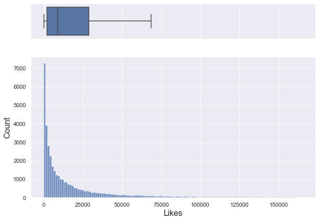
If you only look at data below 95% percentile, it is a right-skewed graph with a median of about 8,780.
np.log(df_youtube_canada[df_youtube_canada["likes"] > 0].likes).describe()
count    40597.000000
mean         8.951208
std          1.969017
min          0.000000
25%          7.727535
50%          9.095154
75%         10.275051
max         15.435560
Name: likes, dtype: float64
checkPlots(data = df_youtube_canada, column = "likes", isLogTransform = True)
Looking at the log-transformed graph, the lag plot and run sequence plot do not show any pattern. Although the qq plot deviated a little from the diagonal, it can be seen that it is almost like a bell shape. Therefore, the log-transformed likes approximates the normal distribution.
Dislikes
df_youtube_canada["dislikes"].describe()
count    4.088100e+04
mean     2.009195e+03
std      1.900837e+04
min      0.000000e+00
25%      9.900000e+01
50%      3.030000e+02
75%      9.500000e+02
max      1.602383e+06
Name: dislikes, dtype: float64
sns.set(style="darkgrid")
plt.figure(figsize = (8, 7))

sns.histplot(x = df_youtube_canada["dislikes"])
plt.xlabel("Dislikes", fontsize = 16)
plt.ylabel("Count", fontsize = 16)

plt.show()
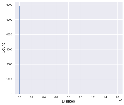
The dislikes column has a very large deviation with a minimum value of 0 and a maximum value of about 1,600,000. Therefore, the standard deviation is also very large of 19,000. For this reason, even if you draw a histogram, you cannot check the distribution properly as above. To see the distribution in more detail, let’s check only the data within the 95% percentile.
percentile_95_dislikes = np.percentile(df_youtube_canada["dislikes"], 95)
percentile_95_dislikes
6479.0
95% percentile of likes column is 6,479.
sns.set(style="darkgrid")

fig, (ax_box, ax_hist) = plt.subplots(2, sharex = True, gridspec_kw = {"height_ratios": (.2, .8)}, figsize = (10, 7))

sns.boxplot(x = df_youtube_canada.dislikes, ax = ax_box, showfliers = False)
sns.histplot(x = df_youtube_canada[df_youtube_canada["dislikes"] <= percentile_95_dislikes].dislikes, ax = ax_hist)

plt.xlabel("Dislikes", fontsize = 16)
plt.ylabel("Count", fontsize = 16)
ax_box.set_xlabel("")

plt.show()
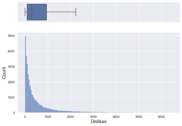
If you only look at data below 95% percentile, it is a right-skewed graph with a median of about 303.
np.log(df_youtube_canada[df_youtube_canada["dislikes"] > 0].dislikes).describe()
count    40488.000000
mean         5.761168
std          1.796411
min          0.000000
25%          4.634729
50%          5.733341
75%          6.870313
max         14.287002
Name: dislikes, dtype: float64
checkPlots(data = df_youtube_canada, column = "dislikes", isLogTransform = True)
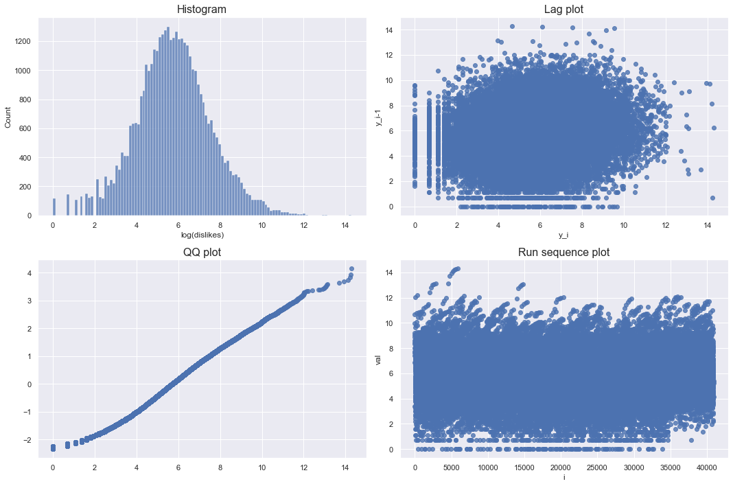
Looking at the log-transformed graph, the lag plot and run sequence plot do not show any pattern. Also, qqplot is almost diagonal. Therefore, the log-transformed dislikes approximates the normal distribution.
Comment counts
df_youtube_canada["comment_count"].describe()
count    4.088100e+04
mean     5.042975e+03
std      2.157902e+04
min      0.000000e+00
25%      4.170000e+02
50%      1.301000e+03
75%      3.713000e+03
max      1.114800e+06
Name: comment_count, dtype: float64
sns.set(style="darkgrid")
plt.figure(figsize = (8, 7))

sns.histplot(x = df_youtube_canada["comment_count"])
plt.xlabel("Comment counts", fontsize = 16)
plt.ylabel("Count", fontsize = 16)

plt.show()
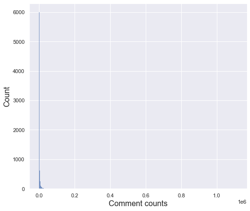
The comment counts column has a very large deviation with a minimum value of 0 and a maximum value of 1,114,800. Therefore, the standard deviation is also very large of 21,579. For this reason, even if you draw a histogram, you cannot check the distribution properly as above. To see the distribution in more detail, let’s check only the data within the 95% percentile
percentile_95_comments = np.percentile(df_youtube_canada["comment_count"], 95)
percentile_95_comments
19210.0
95% percentile of comment counts column is 19210.
sns.set(style="darkgrid")

fig, (ax_box, ax_hist) = plt.subplots(2, sharex = True, gridspec_kw = {"height_ratios": (.2, .8)}, figsize = (10, 7))

sns.boxplot(x = df_youtube_canada.comment_count, ax = ax_box, showfliers = False)
sns.histplot(x = df_youtube_canada[df_youtube_canada["comment_count"] <= percentile_95_comments].comment_count, ax = ax_hist)

plt.xlabel("Comment counts", fontsize = 16)
plt.ylabel("Count", fontsize = 16)
ax_box.set_xlabel("")

plt.show()
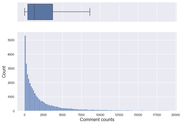
If you only look at data below 95% percentile, it is a right-skewed graph with a median of about 1,301.
np.log(df_youtube_canada[df_youtube_canada["comment_count"] > 0].comment_count).describe()
count    40235.000000
mean         7.116182
std          1.752948
min          0.000000
25%          6.102559
50%          7.202661
75%          8.238801
max         13.924186
Name: comment_count, dtype: float64
checkPlots(data = df_youtube_canada, column = "comment_count", isLogTransform = True)
Looking at the log-transformed graph, the lag plot and run sequence plot do not show any pattern. Although the qq plot deviated a little from the diagonal, it can be seen that it is almost like a bell shape. Therefore, the log-transformed comment counts approximates the normal distribution.
Pair plot
plt.figure(figsize = (20,20))
sns.pairplot(df_youtube_canada, vars = ['views', 'likes', 'dislikes', 'comment_count'])
plt.show()
<Figure size 1440x1440 with 0 Axes>
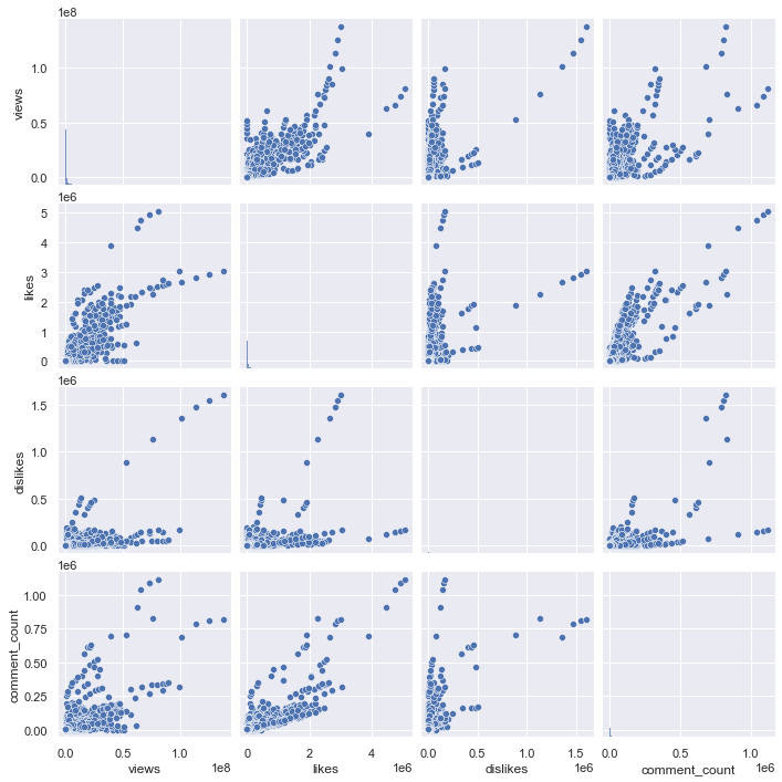
Above is a pair plot of views, likes, dislikes, and comment_counts. It is difficult to check the overall distribution because of some extreme values, so let’s draw only the data below the 95% percentile for each column. Also, since there are too many points, it is difficult to check the distribution with a simple scatter plot, so let’s check it with a kde plot.
df_youtube_canada["country"] = "Canada"

df_youtube_canada_under_percentile = df_youtube_canada[(df_youtube_canada.views <= np.percentile(df_youtube_canada.views, 95)) & \
                                                       (df_youtube_canada.likes <= np.percentile(df_youtube_canada.likes, 95)) & \
                                                       (df_youtube_canada.dislikes <= np.percentile(df_youtube_canada.dislikes, 95)) & \
                                                       (df_youtube_canada.comment_count <= np.percentile(df_youtube_canada.comment_count, 95))]
df_youtube_canada.shape, df_youtube_canada_under_percentile.shape
((40881, 17), (37131, 17))
When only data that falls below the 95% percentile for each column are selected, only 3000 data out of a total of 40,000 are excluded, so it can be seen that the distribution is not affected significantly.
plt.figure(figsize = (20,20))
sns.pairplot(df_youtube_canada_under_percentile, vars = ['views', 'likes', 'dislikes', 'comment_count'], kind = "kde")
plt.show()
<Figure size 1440x1440 with 0 Axes>
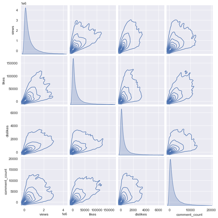
The above shows a kde pair plot of columns. But for kde plot, the code takes too long to run, so let’s sample only 3000 and draw it.
np.random.seed(0)
plt.figure(figsize = (20,20))
sns.pairplot(df_youtube_canada_under_percentile.sample(3000), vars = ['views', 'likes', 'dislikes', 'comment_count'], kind = "kde")
plt.show()
<Figure size 1440x1440 with 0 Axes>
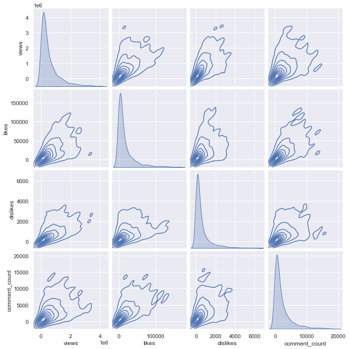
Comparing the kde plot of the total 37000 data and the kde plot of the sampled 3000 data shows almost similarities. Of course, it would be good to compare the distribution through the entire data, but since there is a problem that the code does not run, let’s sample only 3000 data for each country and compare the kde plot.
# read France data
df_youtube_france = pd.read_csv("./data/FRvideos.csv")
df_youtube_france["country"] = "France"

df_youtube_france_under_percentile = df_youtube_france[(df_youtube_france.views <= np.percentile(df_youtube_france.views, 95)) & \
                                                       (df_youtube_france.likes <= np.percentile(df_youtube_france.likes, 95)) & \
                                                       (df_youtube_france.dislikes <= np.percentile(df_youtube_france.dislikes, 95)) & \
                                                       (df_youtube_france.comment_count <= np.percentile(df_youtube_france.comment_count, 95))]

# read US data
df_youtube_us = pd.read_csv("./data/USvideos.csv")
df_youtube_us["country"] = "United States"

df_youtube_us_under_percentile = df_youtube_us[(df_youtube_us.views <= np.percentile(df_youtube_us.views, 95)) & \
                                               (df_youtube_us.likes <= np.percentile(df_youtube_us.likes, 95)) & \
                                               (df_youtube_us.dislikes <= np.percentile(df_youtube_us.dislikes, 95)) & \
                                               (df_youtube_us.comment_count <= np.percentile(df_youtube_us.comment_count, 95))]

# read Germany data
df_youtube_germany = pd.read_csv("./data/DEvideos.csv")
df_youtube_germany["country"] = "Germany"

df_youtube_germany_under_percentile = df_youtube_germany[(df_youtube_germany.views <= np.percentile(df_youtube_germany.views, 95)) & \
                                                         (df_youtube_germany.likes <= np.percentile(df_youtube_germany.likes, 95)) & \
                                                         (df_youtube_germany.dislikes <= np.percentile(df_youtube_germany.dislikes, 95)) & \
                                                         (df_youtube_germany.comment_count <= np.percentile(df_youtube_germany.comment_count, 95))]

# read Great Britain data
df_youtube_gb = pd.read_csv("./data/GBvideos.csv")
df_youtube_gb["country"] = "Great Britain"

df_youtube_gb_under_percentile = df_youtube_gb[(df_youtube_gb.views <= np.percentile(df_youtube_gb.views, 95)) & \
                                               (df_youtube_gb.likes <= np.percentile(df_youtube_gb.likes, 95)) & \
                                               (df_youtube_gb.dislikes <= np.percentile(df_youtube_gb.dislikes, 95)) & \
                                               (df_youtube_gb.comment_count <= np.percentile(df_youtube_gb.comment_count, 95))]
plt.figure(figsize = (20,20))
sns.color_palette()
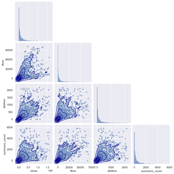
g = sns.pairplot(df_youtube_france_under_percentile.sample(3000), \
vars = ['views', 'likes', 'dislikes', 'comment_count'], \
plot_kws = {'alpha':0.5}, corner = True)
g.map_lower(sns.kdeplot, color = "darkBlue")
plt.show()
<Figure size 1440x1440 with 0 Axes>
plt.figure(figsize = (20,20))
sns.color_palette()
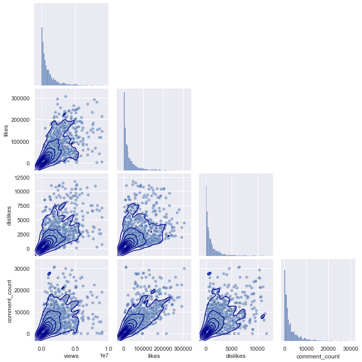
g = sns.pairplot(df_youtube_us_under_percentile.sample(3000), \
vars = ['views', 'likes', 'dislikes', 'comment_count'], \
plot_kws = {'alpha':0.5}, corner = True)
g.map_lower(sns.kdeplot, color = "darkBlue")
plt.show()
<Figure size 1440x1440 with 0 Axes>
plt.figure(figsize = (20,20))
sns.color_palette()
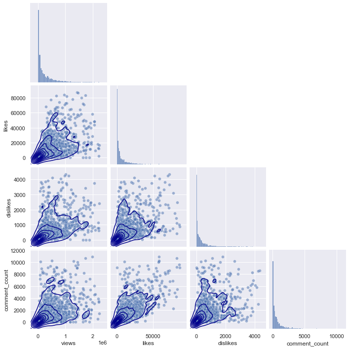
g = sns.pairplot(df_youtube_germany_under_percentile.sample(3000), \
vars = ['views', 'likes', 'dislikes', 'comment_count'], \
plot_kws = {'alpha':0.5}, corner = True)
g.map_lower(sns.kdeplot, color = "darkBlue")
plt.show()
<Figure size 1440x1440 with 0 Axes>
plt.figure(figsize = (20,20))
sns.color_palette()
g = sns.pairplot(df_youtube_gb_under_percentile.sample(3000), \
                 vars = ['views', 'likes', 'dislikes', 'comment_count'], \
                 plot_kws = {'alpha':0.5}, corner = True)
g.map_lower(sns.kdeplot, color = "darkBlue")
plt.show()
<Figure size 1440x1440 with 0 Axes>
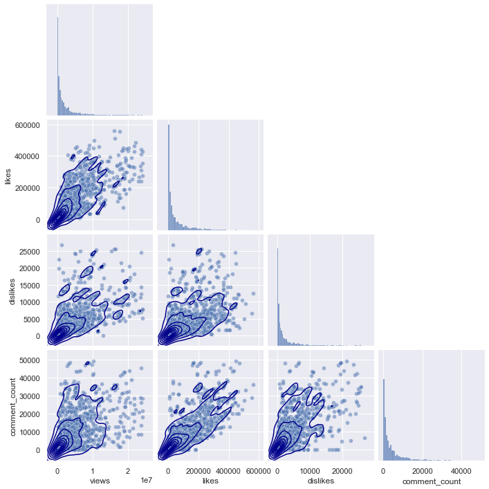
If you look at the pairplots of the other regions, you can see that they all have a similar distribution, starting from (0,0), and gradually spreading as the x-axis and y-axis values increase.
Q2. For 10 Points: Create a heatmap of correlations between the variables for a region of your choice
A heat map (or heatmap) is a graphical representation of data where the individual values contained in a matrix are represented as colors.
Seaborn makes it easy to create a heatmap with seaborn.heatmap()
- Create a correlation matrix for your numeric variables using Pandas with
DataFrame.corr(). That is, if your dataframe is calleddf, usedf.corr(). - Pass in your correlation matrix to
seaborn.heatmap(), and annotate it with the parameterannot=True. - Experiment with colormaps that are different from the default one and choose one that you think is best. Comment on why you think so.
- Are there any interesting correlations? What are they?
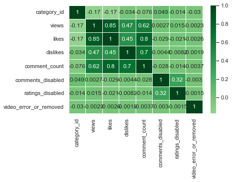
us_corr = df_youtube_us.corr()
us_corr
| category_id | views | likes | dislikes | comment_count | comments_disabled | ratings_disabled | video_error_or_removed | |
|---|---|---|---|---|---|---|---|---|
| category_id | 1.000000 | -0.168231 | -0.173921 | -0.033547 | -0.076307 | 0.048949 | -0.013506 | -0.030011 |
| views | -0.168231 | 1.000000 | 0.849177 | 0.472213 | 0.617621 | 0.002677 | 0.015355 | -0.002256 |
| likes | -0.173921 | 0.849177 | 1.000000 | 0.447186 | 0.803057 | -0.028918 | -0.020888 | -0.002641 |
| dislikes | -0.033547 | 0.472213 | 0.447186 | 1.000000 | 0.700184 | -0.004431 | -0.008230 | -0.001853 |
| comment_count | -0.076307 | 0.617621 | 0.803057 | 0.700184 | 1.000000 | -0.028277 | -0.013819 | -0.003725 |
| comments_disabled | 0.048949 | 0.002677 | -0.028918 | -0.004431 | -0.028277 | 1.000000 | 0.319230 | -0.002970 |
| ratings_disabled | -0.013506 | 0.015355 | -0.020888 | -0.008230 | -0.013819 | 0.319230 | 1.000000 | -0.001526 |
| video_error_or_removed | -0.030011 | -0.002256 | -0.002641 | -0.001853 | -0.003725 | -0.002970 | -0.001526 | 1.000000 |
The above table shows the correlation matrix of numerical variables
df_corr = us_corr.unstack().reset_index().rename(columns = {"level_0" : "var1", "level_1" : "var2", 0 : "correlation"})
mask_dups = (df_corr[['var1', 'var2']].apply(frozenset, axis=1).duplicated()) | (df_corr['var1'] == df_corr['var2'])
df_corr = df_corr[~mask_dups]
df_corr.sort_values("correlation", key = abs, ascending = False).head(5)
| var1 | var2 | correlation | |
|---|---|---|---|
| 10 | views | likes | 0.849177 |
| 20 | likes | comment_count | 0.803057 |
| 28 | dislikes | comment_count | 0.700184 |
| 12 | views | comment_count | 0.617621 |
| 11 | views | dislikes | 0.472213 |
If 5 pairs with high correlation are selected, it is as above. Since views and likes, likes and comment counts have very high values of 0.8 or more, it can be seen that there is a strong linear relationship between the two variables.
sns.heatmap(us_corr, annot = True, linewidths = .5, center = 0)
<AxesSubplot:>
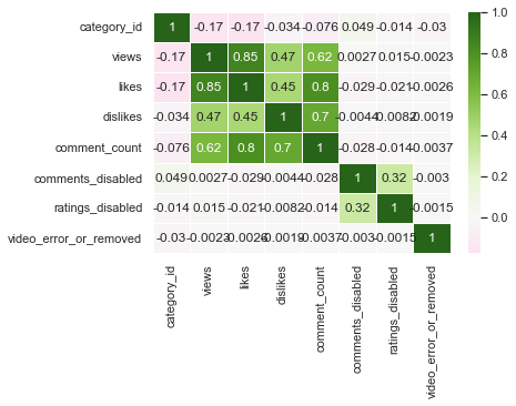
The above graph is a heatmap of the correlation matrix. Let’s try with colormaps that are different from the default one.
sns.heatmap(us_corr, annot = True, linewidths = .5, cmap="YlGnBu", center = 0)
<AxesSubplot:>
sns.heatmap(us_corr, annot = True, linewidths = .5, cmap="Blues", center = 0)
<AxesSubplot:>
sns.heatmap(us_corr, annot = True, linewidths = .5, cmap="BuPu", center = 0)
<AxesSubplot:>
sns.heatmap(us_corr, annot = True, linewidths = .5, cmap="Greens", center = 0)
<AxesSubplot:>
sns.heatmap(us_corr, annot = True, linewidths = .5, cmap="PiYG", center = 0)
<AxesSubplot:>
sns.heatmap(us_corr, annot = True, linewidths = .5, cmap="BrBG", center = 0)
<AxesSubplot:>
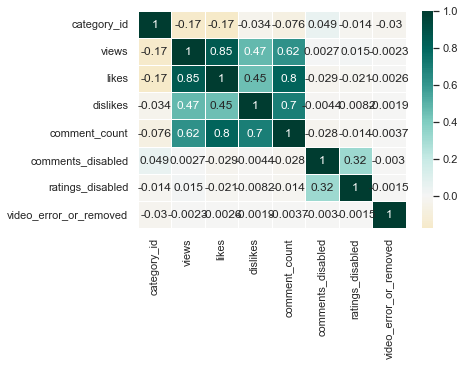
I think BrBG is the best because the distinction between high and low values is clear.
Although correlation was obtained with all numerical columns, category_id, comments_disabled, ratings_disabled, and video_error_or_removed columns do not have numerical meaning. Therefore, it can be seen that only the views, likes, dislikes, and comment_counts columns that have real numerical meaning have high correlation values. Among them, the linear relationship between view and like, like and comment_count, and dislike and comment_count was strong.
Q3. For 15 points: Create and compare OLS models using variables of your choice, for a region of your choice
- Use statsmodels to perform an ANOVA (categorical regression) of a variable of your choice as the dependent variable (for example, views) and the video category as the independent variable. Note that you need to use a categorical variable as your independent variable.
- Provide your interpretation of the results.
- Create two different regression models where the dependent variable is the same, and the independent variables are different. Note that your independent variable needs to be a continuous numerical variables. What does your interpretation say about the two models?
sns.boxplot(x = "category_id", y = "dislikes", data = df_youtube_us, showfliers = False)
plt.show()
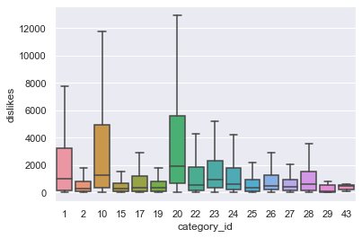
The boxplot between category_id and dislikes in us region is as above. Among category_ids, 1, 10, and 20 seem to have a higher number of dislikes, especially compared to other categories. Let’s check this numerically through anova analysis.
lm0 = smf.ols("dislikes ~ category_id", data = df_youtube_us)
res0 = lm0.fit()
print(res0.summary())
                            OLS Regression Results
==============================================================================
Dep. Variable:               dislikes   R-squared:                       0.001
Model:                            OLS   Adj. R-squared:                  0.001
Method:                 Least Squares   F-statistic:                     46.13
Date:                Tue, 15 Feb 2022   Prob (F-statistic):           1.12e-11
Time:                        15:46:37   Log-Likelihood:            -4.7888e+05
No. Observations:               40949   AIC:                         9.578e+05
Df Residuals:                   40947   BIC:                         9.578e+05
Df Model:                           1
Covariance Type:            nonrobust
===============================================================================
                  coef    std err          t      P>|t|      [0.025      0.975]
-------------------------------------------------------------------------------
Intercept    6281.3987    404.626     15.524      0.000    5488.323    7074.474
category_id  -128.6773     18.945     -6.792      0.000    -165.809     -91.545
==============================================================================
Omnibus:                   118799.008   Durbin-Watson:                   1.996
Prob(Omnibus):                  0.000   Jarque-Bera (JB):       6797851742.784
Skew:                          40.289   Prob(JB):                         0.00
Kurtosis:                    1997.416   Cond. No.                         60.4
==============================================================================

Notes:
[1] Standard Errors assume that the covariance matrix of the errors is correctly specified.
When anova analysis is performed, the F-statistic probability is almost 0. This means that the null hypothesis that there is no significant difference between Generations can be rejected, so it can be seen that there is statistical difference in dislikes between category_id.
tukeyhsd_res0 = pairwise_tukeyhsd(df_youtube_us["dislikes"], df_youtube_us["category_id"])
tukeyhsd_res0.summary()
| group1 | group2 | meandiff | p-adj | lower | upper | reject |
|---|---|---|---|---|---|---|
| 1 | 2 | -1957.8429 | 0.9 | -7401.0862 | 3485.4004 | False |
| 1 | 10 | 5317.0763 | 0.001 | 2933.8638 | 7700.2887 | True |
| 1 | 15 | -2017.4434 | 0.9 | -5863.9747 | 1829.0879 | False |
| 1 | 17 | -229.3424 | 0.9 | -3173.1743 | 2714.4894 | False |
| 1 | 19 | -1743.8481 | 0.9 | -7081.3482 | 3593.652 | False |
| 1 | 20 | 8651.015 | 0.001 | 4634.1106 | 12667.9194 | True |
| 1 | 22 | 583.1195 | 0.9 | -2102.9121 | 3269.151 | False |
| 1 | 23 | -499.1596 | 0.9 | -3144.3733 | 2146.0541 | False |
| 1 | 24 | 1723.6163 | 0.4009 | -545.8102 | 3993.0428 | False |
| 1 | 25 | -909.9219 | 0.9 | -3756.0023 | 1936.1585 | False |
| 1 | 26 | -1270.3971 | 0.9 | -3825.2314 | 1284.4373 | False |
| 1 | 27 | -1774.2732 | 0.8543 | -4948.0451 | 1399.4986 | False |
| 1 | 28 | -696.3033 | 0.9 | -3567.0137 | 2174.4071 | False |
| 1 | 29 | 55486.1782 | 0.001 | 42231.4548 | 68740.9016 | True |
| 1 | 43 | -2160.7165 | 0.9 | -15415.4399 | 11094.0068 | False |
| 2 | 10 | 7274.9192 | 0.001 | 2081.6175 | 12468.2209 | True |
| 2 | 15 | -59.6005 | 0.9 | -6066.8032 | 5947.6022 | False |
| 2 | 17 | 1728.5005 | 0.9 | -3744.7826 | 7201.7835 | False |
| 2 | 19 | 213.9948 | 0.9 | -6841.4704 | 7269.46 | False |
| 2 | 20 | 10608.8579 | 0.001 | 4491.1621 | 16726.5537 | True |
| 2 | 22 | 2540.9624 | 0.9 | -2798.0868 | 7880.0116 | False |
| 2 | 23 | 1458.6833 | 0.9 | -3859.9478 | 6777.3144 | False |
| 2 | 24 | 3681.4592 | 0.5062 | -1460.6199 | 8823.5384 | False |
| 2 | 25 | 1047.921 | 0.9 | -4373.4123 | 6469.2543 | False |
| 2 | 26 | 687.4458 | 0.9 | -4586.8181 | 5961.7097 | False |
| 2 | 27 | 183.5697 | 0.9 | -5416.7436 | 5783.883 | False |
| 2 | 28 | 1261.5396 | 0.9 | -4172.7643 | 6695.8436 | False |
| 2 | 29 | 57444.0211 | 0.001 | 43409.1227 | 71478.9195 | True |
| 2 | 43 | -202.8736 | 0.9 | -14237.772 | 13832.0247 | False |
| 10 | 15 | -7334.5197 | 0.001 | -10818.3808 | -3850.6586 | True |
| 10 | 17 | -5546.4187 | 0.001 | -7997.4655 | -3095.3719 | True |
| 10 | 19 | -7060.9244 | 0.001 | -12143.2853 | -1978.5635 | True |
| 10 | 20 | 3333.9387 | 0.1255 | -337.1655 | 7005.0429 | False |
| 10 | 22 | -4733.9568 | 0.001 | -6868.4943 | -2599.4193 | True |
| 10 | 23 | -5816.2359 | 0.001 | -7899.1762 | -3733.2956 | True |
| 10 | 24 | -3593.46 | 0.001 | -5171.9977 | -2014.9222 | True |
| 10 | 25 | -6226.9982 | 0.001 | -8559.7344 | -3894.2619 | True |
| 10 | 26 | -6587.4734 | 0.001 | -8554.3652 | -4620.5815 | True |
| 10 | 27 | -7091.3495 | 0.001 | -9814.273 | -4368.426 | True |
| 10 | 28 | -6013.3795 | 0.001 | -8376.1032 | -3650.6559 | True |
| 10 | 29 | 50169.1019 | 0.001 | 37015.0464 | 63323.1574 | True |
| 10 | 43 | -7477.7928 | 0.8334 | -20631.8483 | 5676.2627 | False |
| 15 | 17 | 1788.101 | 0.9 | -2100.8233 | 5677.0253 | False |
| 15 | 19 | 273.5953 | 0.9 | -5637.9607 | 6185.1512 | False |
| 15 | 20 | 10668.4584 | 0.001 | 5915.2377 | 15421.6792 | True |
| 15 | 22 | 2600.5629 | 0.5342 | -1097.0515 | 6298.1772 | False |
| 15 | 23 | 1518.2838 | 0.9 | -2149.7868 | 5186.3544 | False |
| 15 | 24 | 3741.0597 | 0.0158 | 334.0254 | 7148.0941 | True |
| 15 | 25 | 1107.5215 | 0.9 | -2707.9418 | 4922.9848 | False |
| 15 | 26 | 747.0463 | 0.9 | -2856.3916 | 4350.4843 | False |
| 15 | 27 | 243.1702 | 0.9 | -3822.591 | 4308.9314 | False |
| 15 | 28 | 1321.1401 | 0.9 | -2512.7306 | 5155.0108 | False |
| 15 | 29 | 57503.6216 | 0.001 | 44007.5008 | 70999.7424 | True |
| 15 | 43 | -143.2731 | 0.9 | -13639.394 | 13352.8477 | False |
| 17 | 19 | -1514.5057 | 0.9 | -6882.6372 | 3853.6259 | False |
| 17 | 20 | 8880.3574 | 0.001 | 4822.8397 | 12937.8752 | True |
| 17 | 22 | 812.4619 | 0.9 | -1933.9347 | 3558.8586 | False |
| 17 | 23 | -269.8172 | 0.9 | -2976.3065 | 2436.6722 | False |
| 17 | 24 | 1952.9588 | 0.2363 | -387.6022 | 4293.5197 | False |
| 17 | 25 | -680.5795 | 0.9 | -3583.6989 | 2222.54 | False |
| 17 | 26 | -1041.0546 | 0.9 | -3659.2807 | 1577.1714 | False |
| 17 | 27 | -1544.9308 | 0.9 | -4769.9512 | 1680.0896 | False |
| 17 | 28 | -466.9608 | 0.9 | -3394.2304 | 2460.3087 | False |
| 17 | 29 | 55715.5206 | 0.001 | 42448.4328 | 68982.6085 | True |
| 17 | 43 | -1931.3741 | 0.9 | -15198.4619 | 11335.7138 | False |
| 19 | 20 | 10394.8631 | 0.001 | 4371.0594 | 16418.6669 | True |
| 19 | 22 | 2326.9676 | 0.9 | -2904.2327 | 7558.1679 | False |
| 19 | 23 | 1244.6885 | 0.9 | -3965.671 | 6455.048 | False |
| 19 | 24 | 3467.4644 | 0.5652 | -1562.5442 | 8497.4731 | False |
| 19 | 25 | 833.9262 | 0.9 | -4481.228 | 6149.0804 | False |
| 19 | 26 | 473.451 | 0.9 | -4691.6113 | 5638.5134 | False |
| 19 | 27 | -30.4251 | 0.9 | -5528.0172 | 5467.1669 | False |
| 19 | 28 | 1047.5448 | 0.9 | -4280.8385 | 6375.9282 | False |
| 19 | 29 | 57230.0263 | 0.001 | 43235.7996 | 71224.253 | True |
| 19 | 43 | -416.8684 | 0.9 | -14411.0952 | 13577.3583 | False |
| 20 | 22 | -8067.8955 | 0.001 | -11942.4368 | -4193.3543 | True |
| 20 | 23 | -9150.1746 | 0.001 | -12996.5313 | -5303.8179 | True |
| 20 | 24 | -6927.3987 | 0.001 | -10525.6762 | -3329.1212 | True |
| 20 | 25 | -9560.9369 | 0.001 | -13548.1011 | -5573.7727 | True |
| 20 | 26 | -9921.4121 | 0.001 | -13706.182 | -6136.6422 | True |
| 20 | 27 | -10425.2882 | 0.001 | -14652.5961 | -6197.9803 | True |
| 20 | 28 | -9347.3183 | 0.001 | -13352.1007 | -5342.5358 | True |
| 20 | 29 | 46835.1632 | 0.001 | 33289.4998 | 60380.8265 | True |
| 20 | 43 | -10811.7315 | 0.3086 | -24357.3949 | 2733.9318 | False |
| 22 | 23 | -1082.2791 | 0.9 | -3505.8517 | 1341.2935 | False |
| 22 | 24 | 1140.4968 | 0.8337 | -866.2033 | 3147.1969 | False |
| 22 | 25 | -1493.0414 | 0.8405 | -4134.39 | 1148.3072 | False |
| 22 | 26 | -1853.5166 | 0.3103 | -4178.1084 | 471.0753 | False |
| 22 | 27 | -2357.3927 | 0.3306 | -5348.9436 | 634.1581 | False |
| 22 | 28 | -1279.4228 | 0.9 | -3947.2921 | 1388.4466 | False |
| 22 | 29 | 54903.0587 | 0.001 | 41690.7826 | 68115.3348 | True |
| 22 | 43 | -2743.836 | 0.9 | -15956.1121 | 10468.4401 | False |
| 23 | 24 | 2222.7759 | 0.0094 | 271.0497 | 4174.5022 | True |
| 23 | 25 | -410.7623 | 0.9 | -3010.5916 | 2189.067 | False |
| 23 | 26 | -771.2375 | 0.9 | -3048.5423 | 1506.0674 | False |
| 23 | 27 | -1275.1136 | 0.9 | -4230.0699 | 1679.8426 | False |
| 23 | 28 | -197.1437 | 0.9 | -2823.913 | 2429.6256 | False |
| 23 | 29 | 55985.3378 | 0.001 | 42781.2994 | 69189.3762 | True |
| 23 | 43 | -1661.5569 | 0.9 | -14865.5953 | 11542.4815 | False |
| 24 | 25 | -2633.5382 | 0.0048 | -4849.8986 | -417.1778 | True |
| 24 | 26 | -2994.0134 | 0.001 | -4821.3772 | -1166.6496 | True |
| 24 | 27 | -3497.8896 | 0.001 | -6121.8003 | -873.9788 | True |
| 24 | 28 | -2419.9196 | 0.0207 | -4667.8204 | -172.0188 | True |
| 24 | 29 | 53762.5619 | 0.001 | 40628.6451 | 66896.4787 | True |
| 24 | 43 | -3884.3329 | 0.9 | -17018.2497 | 9249.584 | False |
| 25 | 26 | -360.4752 | 0.9 | -2868.2901 | 2147.3397 | False |
| 25 | 27 | -864.3513 | 0.9 | -4000.3973 | 2271.6947 | False |
| 25 | 28 | 213.6186 | 0.9 | -2615.3273 | 3042.5645 | False |
| 25 | 29 | 56396.1001 | 0.001 | 43150.3593 | 69641.8409 | True |
| 25 | 43 | -1250.7946 | 0.9 | -14496.5354 | 11994.9461 | False |
| 26 | 27 | -503.8762 | 0.9 | -3378.2091 | 2370.4567 | False |
| 26 | 28 | 574.0938 | 0.9 | -1961.6388 | 3109.8264 | False |
| 26 | 29 | 56756.5753 | 0.001 | 43570.3456 | 69942.805 | True |
| 26 | 43 | -890.3195 | 0.9 | -14076.5491 | 12295.9102 | False |
| 27 | 28 | 1077.97 | 0.9 | -2080.4456 | 4236.3856 | False |
| 27 | 29 | 57260.4514 | 0.001 | 43940.4551 | 70580.4478 | True |
| 27 | 43 | -386.4433 | 0.9 | -13706.4396 | 12933.553 | False |
| 28 | 29 | 56182.4815 | 0.001 | 42931.4267 | 69433.5362 | True |
| 28 | 43 | -1464.4133 | 0.9 | -14715.468 | 11786.6415 | False |
| 29 | 43 | -57646.8947 | 0.001 | -76168.1573 | -39125.6322 | True |
The above shows the turkeyhsd table for dislikes between category_id. When the reject column is true, it can be interpreted that there is a statistically significant difference between the two groups. As can be seen from the table above, there are many pairs with a significant difference in dislikes between category_id.
Also, after merging the data from all 5 regions, let’s check if there is a significant difference in the dislike value by region.
df_youtube = pd.concat([df_youtube_canada, df_youtube_france, df_youtube_us, df_youtube_germany,
                        df_youtube_gb], axis = 0, ignore_index = True)
sns.boxplot(x = "country", y = "dislikes", data=df_youtube, showfliers = False)
<AxesSubplot:xlabel='country', ylabel='dislikes'>
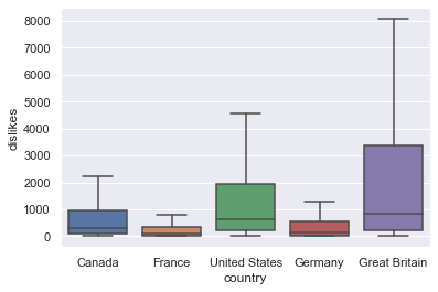
Looking at the boxplot, it seems that United States and Great Britain regions have particularly high dislikes. Let’s check this numerically through anova analysis.
lm0 = smf.ols("dislikes ~ country", data = df_youtube)
res0 = lm0.fit()
print(res0.summary())
                            OLS Regression Results
==============================================================================
Dep. Variable:               dislikes   R-squared:                       0.007
Model:                            OLS   Adj. R-squared:                  0.007
Method:                 Least Squares   F-statistic:                     365.5
Date:                Tue, 15 Feb 2022   Prob (F-statistic):          3.44e-314
Time:                        15:52:38   Log-Likelihood:            -2.3623e+06
No. Observations:              202310   AIC:                         4.725e+06
Df Residuals:                  202305   BIC:                         4.725e+06
Df Model:                           4
Covariance Type:            nonrobust
============================================================================================
                               coef    std err          t      P>|t|      [0.025      0.975]
--------------------------------------------------------------------------------------------
Intercept                 2009.1954    140.942     14.256      0.000    1732.953    2285.438
country[T.France]        -1194.2331    199.514     -5.986      0.000   -1585.275    -803.191
country[T.Germany]        -612.0595    199.372     -3.070      0.002   -1002.823    -221.296
country[T.Great Britain]  5603.3645    201.822     27.764      0.000    5207.798    5998.931
country[T.United States]  1702.2054    199.239      8.544      0.000    1311.702    2092.709
==============================================================================
Omnibus:                   609442.615   Durbin-Watson:                   1.976
Prob(Omnibus):                  0.000   Jarque-Bera (JB):      50644814857.182
Skew:                          44.672   Prob(JB):                         0.00
Kurtosis:                    2452.490   Cond. No.                         5.80
==============================================================================

Notes:
[1] Standard Errors assume that the covariance matrix of the errors is correctly specified.
When anova analysis is performed, the F-statistic probability is almost 0. This means that the null hypothesis that there is no significant difference between Generations can be rejected, so it can be seen that there is statistical difference in dislikes between 5 regeions.
tukeyhsd_res0 = pairwise_tukeyhsd(df_youtube["dislikes"], df_youtube["country"])
tukeyhsd_res0.summary()
| group1 | group2 | meandiff | p-adj | lower | upper | reject |
|---|---|---|---|---|---|---|
| Canada | France | -1194.2331 | 0.001 | -1738.4618 | -650.0043 | True |
| Canada | Germany | -612.0595 | 0.0182 | -1155.9009 | -68.2181 | True |
| Canada | Great Britain | 5603.3645 | 0.001 | 5052.839 | 6153.8901 | True |
| Canada | United States | 1702.2054 | 0.001 | 1158.7263 | 2245.6846 | True |
| France | Germany | 582.1735 | 0.0291 | 37.8085 | 1126.5386 | True |
| France | Great Britain | 6797.5976 | 0.001 | 6246.5548 | 7348.6404 | True |
| France | United States | 2896.4385 | 0.001 | 2352.4353 | 3440.4417 | True |
| Germany | Great Britain | 6215.4241 | 0.001 | 5664.7638 | 6766.0843 | True |
| Germany | United States | 2314.265 | 0.001 | 1770.6493 | 2857.8806 | True |
| Great Britain | United States | -3901.1591 | 0.001 | -4451.4617 | -3350.8565 | True |
The above shows the turkeyhsd table for dislikes between regeions. When the reject column is true, it can be interpreted that there is a statistically significant difference between the two groups. As can be seen from the table above, All different regeion pairs showed statistically significant differences in dislike values.
Part 2: Answer the questions below based on the Pokémon dataset </span>
- Write Python code that can answer the following questions, and
- Explain your answers in plain English.
df_pokemon = pd.read_csv("./data/Pokemon.csv")
df_pokemon.head()
| # | Name | Type 1 | Type 2 | Total | HP | Attack | Defense | Sp. Atk | Sp. Def | Speed | Generation | Legendary | |
|---|---|---|---|---|---|---|---|---|---|---|---|---|---|
| 0 | 1 | Bulbasaur | Grass | Poison | 318 | 45 | 49 | 49 | 65 | 65 | 45 | 1 | False |
| 1 | 2 | Ivysaur | Grass | Poison | 405 | 60 | 62 | 63 | 80 | 80 | 60 | 1 | False |
| 2 | 3 | Venusaur | Grass | Poison | 525 | 80 | 82 | 83 | 100 | 100 | 80 | 1 | False |
| 3 | 3 | VenusaurMega Venusaur | Grass | Poison | 625 | 80 | 100 | 123 | 122 | 120 | 80 | 1 | False |
| 4 | 4 | Charmander | Fire | NaN | 309 | 39 | 52 | 43 | 60 | 50 | 65 | 1 | False |
Delete the “#” column because it is an index.
df_pokemon.drop("#", axis = 1, inplace = True)
df_pokemon.head()
| Name | Type 1 | Type 2 | Total | HP | Attack | Defense | Sp. Atk | Sp. Def | Speed | Generation | Legendary | |
|---|---|---|---|---|---|---|---|---|---|---|---|---|
| 0 | Bulbasaur | Grass | Poison | 318 | 45 | 49 | 49 | 65 | 65 | 45 | 1 | False |
| 1 | Ivysaur | Grass | Poison | 405 | 60 | 62 | 63 | 80 | 80 | 60 | 1 | False |
| 2 | Venusaur | Grass | Poison | 525 | 80 | 82 | 83 | 100 | 100 | 80 | 1 | False |
| 3 | VenusaurMega Venusaur | Grass | Poison | 625 | 80 | 100 | 123 | 122 | 120 | 80 | 1 | False |
| 4 | Charmander | Fire | NaN | 309 | 39 | 52 | 43 | 60 | 50 | 65 | 1 | False |
df_pokemon.shape
(800, 12)
Pokemon data consists of a total of 800 rows and 12 columns.
df_pokemon.info()
<class 'pandas.core.frame.DataFrame'>
RangeIndex: 800 entries, 0 to 799
Data columns (total 12 columns):
 #   Column      Non-Null Count  Dtype
---  ------      --------------  -----
 0   Name        800 non-null    object
 1   Type 1      800 non-null    object
 2   Type 2      414 non-null    object
 3   Total       800 non-null    int64
 4   HP          800 non-null    int64
 5   Attack      800 non-null    int64
 6   Defense     800 non-null    int64
 7   Sp. Atk     800 non-null    int64
 8   Sp. Def     800 non-null    int64
 9   Speed       800 non-null    int64
 10  Generation  800 non-null    int64
 11  Legendary   800 non-null    bool
dtypes: bool(1), int64(8), object(3)
memory usage: 69.7+ KB
It can be seen that only type2 has a missing value.
Q4. For 10 Points: Plot the pairs of different ability points (HP, Attack, Sp. Attack, Defense, etc.).
- Which pairs have the most/least correlation coefficients?
sns.pairplot(data = df_pokemon, vars = ["Total", "HP", "Attack", "Defense", "Sp. Atk", "Sp. Def", "Speed"], \
             kind = "reg", plot_kws={'line_kws':{'color':'red'}, 'scatter_kws': {'alpha': 0.5}}, corner = True)
<seaborn.axisgrid.PairGrid at 0x7f77fbf8e9d0>
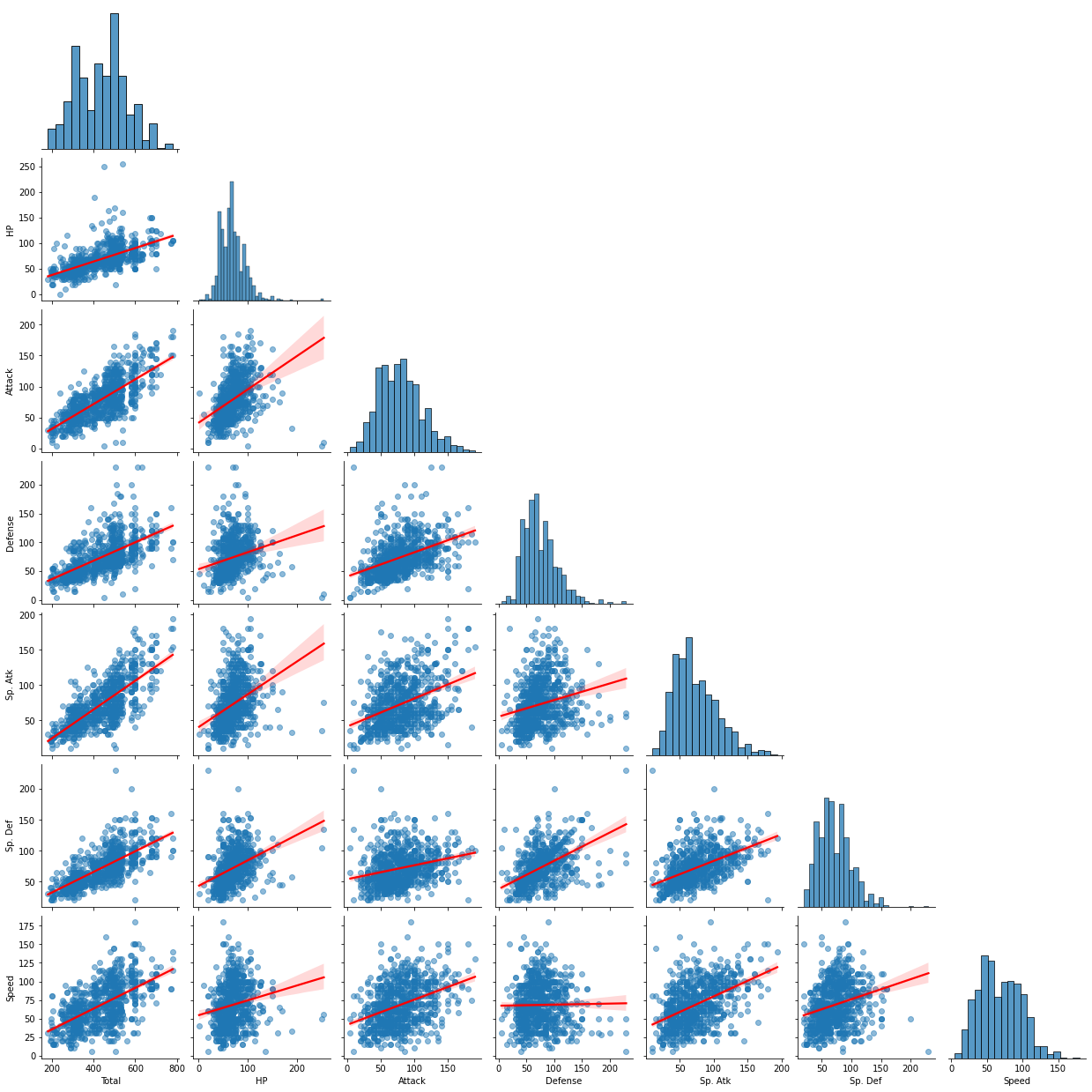
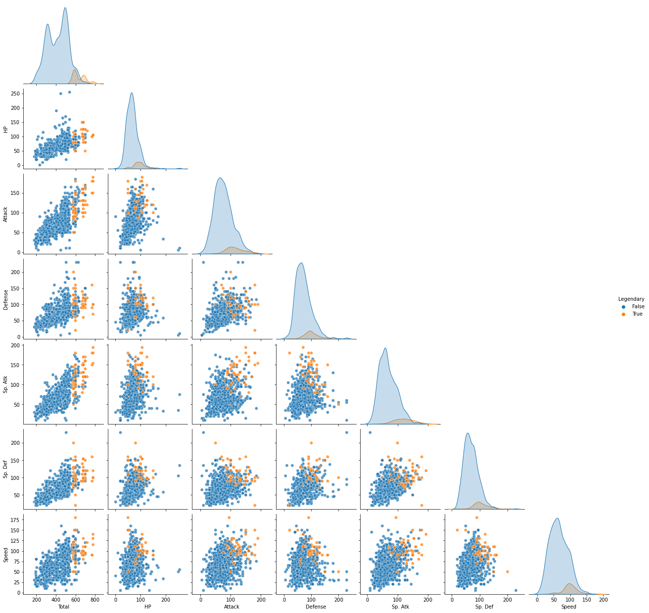
The graph above is a pair plot of different abilities. Through the red regression line in each scatter plot, it is possible to check how much linear relationship there is between the two variables. When visually confirmed, the linear relationship between HP and Attack, and Total and Sp.Atk was strongest, and the linear relationship between Defense and Speed was the smallest. Let’s check this numerically.
pokemon_ability_corr = df_pokemon[["Total", "HP", "Attack", "Defense", "Sp. Atk", "Sp. Def", "Speed"]].corr()
pokemon_ability_corr
| Total | HP | Attack | Defense | Sp. Atk | Sp. Def | Speed | |
|---|---|---|---|---|---|---|---|
| Total | 1.000000 | 0.618748 | 0.736211 | 0.612787 | 0.747250 | 0.717609 | 0.575943 |
| HP | 0.618748 | 1.000000 | 0.422386 | 0.239622 | 0.362380 | 0.378718 | 0.175952 |
| Attack | 0.736211 | 0.422386 | 1.000000 | 0.438687 | 0.396362 | 0.263990 | 0.381240 |
| Defense | 0.612787 | 0.239622 | 0.438687 | 1.000000 | 0.223549 | 0.510747 | 0.015227 |
| Sp. Atk | 0.747250 | 0.362380 | 0.396362 | 0.223549 | 1.000000 | 0.506121 | 0.473018 |
| Sp. Def | 0.717609 | 0.378718 | 0.263990 | 0.510747 | 0.506121 | 1.000000 | 0.259133 |
| Speed | 0.575943 | 0.175952 | 0.381240 | 0.015227 | 0.473018 | 0.259133 | 1.000000 |
sns.heatmap(pokemon_ability_corr, annot = True, linewidths = .5, cmap="BrBG", center = 0)
<AxesSubplot:>
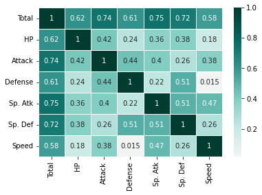
Looking at the above table and heat map, it can be seen that total has a strong linear relationship with all other abilities. Since the stat name is total, it can be inferred that total is the sum of other abilities.
np.sum(df_pokemon.Total != df_pokemon["HP"] + df_pokemon["Attack"] + df_pokemon["Defense"] + \
                           df_pokemon["Sp. Atk"] + df_pokemon["Sp. Def"] + df_pokemon["Speed"])
0
As expected, it can be seen that total is the simple sum of the remaining 6 ability values. Therefore, let’s check the linear relationship between the other abilities except for the total ability.
pokemon_ability_corr = df_pokemon[["HP", "Attack", "Defense", "Sp. Atk", "Sp. Def", "Speed"]].corr()
pokemon_ability_corr
| HP | Attack | Defense | Sp. Atk | Sp. Def | Speed | |
|---|---|---|---|---|---|---|
| HP | 1.000000 | 0.422386 | 0.239622 | 0.362380 | 0.378718 | 0.175952 |
| Attack | 0.422386 | 1.000000 | 0.438687 | 0.396362 | 0.263990 | 0.381240 |
| Defense | 0.239622 | 0.438687 | 1.000000 | 0.223549 | 0.510747 | 0.015227 |
| Sp. Atk | 0.362380 | 0.396362 | 0.223549 | 1.000000 | 0.506121 | 0.473018 |
| Sp. Def | 0.378718 | 0.263990 | 0.510747 | 0.506121 | 1.000000 | 0.259133 |
| Speed | 0.175952 | 0.381240 | 0.015227 | 0.473018 | 0.259133 | 1.000000 |
sns.heatmap(pokemon_ability_corr, annot = True, linewidths = .5, cmap="BrBG", center = 0)
<AxesSubplot:>
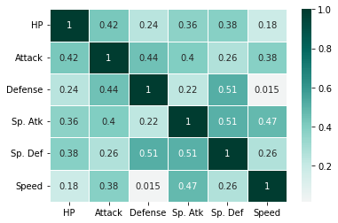
When Total was excluded, Defense and Sp.Def, and Sp.Atk and Sp.Def showed the highest correlation at 0.51. Also, since the correlation between Speed and Defense is 0.015, as confirmed in the pair plot earlier, it can be seen that there is little linear relationship between the two abilities.
Q5. For 15 Points: Plot the distribution of ability points per Pokémon type
- How would you describe each Pokémon type with different ability points?
There are two types of Pokemon: Type1 and Type2.
df_pokemon.info()
<class 'pandas.core.frame.DataFrame'>
RangeIndex: 800 entries, 0 to 799
Data columns (total 12 columns):
 #   Column      Non-Null Count  Dtype
---  ------      --------------  -----
 0   Name        800 non-null    object
 1   Type 1      800 non-null    object
 2   Type 2      414 non-null    object
 3   Total       800 non-null    int64
 4   HP          800 non-null    int64
 5   Attack      800 non-null    int64
 6   Defense     800 non-null    int64
 7   Sp. Atk     800 non-null    int64
 8   Sp. Def     800 non-null    int64
 9   Speed       800 non-null    int64
 10  Generation  800 non-null    int64
 11  Legendary   800 non-null    bool
dtypes: bool(1), int64(8), object(3)
memory usage: 69.7+ KB
Looking at the table above, all Pokemon have Type1, but about half do not have Type2.
print(sorted(df_pokemon["Type 1"].unique()))
['Bug', 'Dark', 'Dragon', 'Electric', 'Fairy', 'Fighting', 'Fire', 'Flying', 'Ghost', 'Grass', 'Ground', 'Ice', 'Normal', 'Poison', 'Psychic', 'Rock', 'Steel', 'Water']
There are a total of 18 types in Type1 as shown in the list above.
print(sorted(df_pokemon[df_pokemon["Type 2"].isnull() == False]["Type 2"].unique()))
['Bug', 'Dark', 'Dragon', 'Electric', 'Fairy', 'Fighting', 'Fire', 'Flying', 'Ghost', 'Grass', 'Ground', 'Ice', 'Normal', 'Poison', 'Psychic', 'Rock', 'Steel', 'Water']
As in the list above, in Type2, there are a total of 18 types. If we compare Type1 and Type2, we can confirm that they are all the same. It is said that the order of Type1 and Type2 is not important in the real Pokemon world. (https://forums.serebii.net/threads/does-type-order-really-matter.316547/)
# Create data by combining type1 and type2 columns as one Type column. Dual type Pokemon will have 2 rows.
df_pokemon_type_indifference = df_pokemon[['Name', 'Total', 'HP', 'Attack', 'Defense', 'Sp. Atk', \
                                           'Sp. Def', 'Speed', 'Generation', 'Legendary']] \
                                   .merge(pd.concat([df_pokemon[["Name", "Type 1"]].rename(columns = {"Type 1" : "Type"}), \
                                                     df_pokemon[["Name", "Type 2"]].rename(columns = {"Type 2" : "Type"})], \
                                                     axis = 0, ignore_index = True), \
                                          on = "Name", how = "left") \
                                   [["Name", "Type", "Total", "HP", "Attack", 'Defense', 'Sp. Atk', \
                                     'Sp. Def', 'Speed', 'Generation', 'Legendary']]
type_count = df_pokemon_type_indifference.Type.value_counts().reset_index().rename(columns = {"index" : "Type", "Type" : "Total Count"}) \
             .merge(df_pokemon[df_pokemon["Type 2"].isnull()]["Type 1"].value_counts().reset_index() \
             .rename(columns = {"index" : "Type", "Type 1" : "Single-type Count"}), on = "Type", how = "left")
type_count["Single-type Ratio"] = np.round(type_count["Single-type Count"] / type_count["Total Count"] * 100, 2)
type_count
| Type | Total Count | Single-type Count | Single-type Ratio | |
|---|---|---|---|---|
| 0 | Water | 126 | 59 | 46.83 |
| 1 | Normal | 102 | 61 | 59.80 |
| 2 | Flying | 101 | 2 | 1.98 |
| 3 | Grass | 95 | 33 | 34.74 |
| 4 | Psychic | 90 | 38 | 42.22 |
| 5 | Bug | 72 | 17 | 23.61 |
| 6 | Ground | 67 | 13 | 19.40 |
| 7 | Fire | 64 | 28 | 43.75 |
| 8 | Poison | 62 | 15 | 24.19 |
| 9 | Rock | 58 | 9 | 15.52 |
| 10 | Fighting | 53 | 20 | 37.74 |
| 11 | Dark | 51 | 10 | 19.61 |
| 12 | Dragon | 50 | 11 | 22.00 |
| 13 | Electric | 50 | 27 | 54.00 |
| 14 | Steel | 49 | 5 | 10.20 |
| 15 | Ghost | 46 | 10 | 21.74 |
| 16 | Fairy | 40 | 15 | 37.50 |
| 17 | Ice | 38 | 13 | 34.21 |
plt.figure(figsize = (15, 7))

# bar graph for total pokemon count
color = "darkblue"
ax1 = sns.barplot(x = "Type", y = "Total Count", color = color, alpha = 0.8, \
                  data = type_count)
ax1.set_xlabel("Type", fontsize = 16)
top_bar = mpatches.Patch(color = color, label = 'Num of Total Pokemon')

# bar graph for total non-type2 pokemon count
color = "lightblue"
ax2 = sns.barplot(x = "Type", y = "Single-type Count",  color = color, alpha = 0.8, \
                  data = type_count)
ax2.set_ylabel("Num of Pokemon", fontsize = 16)
low_bar = mpatches.Patch(color = color, label = 'Num of single-type Pokemon')

plt.legend(handles=[top_bar, low_bar])
plt.show()
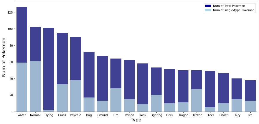
The table and graph above show the total number of Pokemon and total number of single-type Pokemon for each type. Looking at the number of total pokemon, the most common type is Water type, followed by Normal, Flying, Grass, and Psychic type. The types with the fewest Pokemon are fairy and ice types. It can be seen that Pokemon belonging to the water type are three times larger than the Pokemon belonging to the ice type. Also, when looking at the ratio of single-type Pokemon, about 20 to 50% of Pokemon belonging to each type were single-type Pokémon. However, the ratio of Flying type is 1.98% and Steel type1 is 10.2%, which is very small compared to other types. In other words, most Flying and Steel type Pokemon are dual type Pokemon with another type. On the other hand, in electric, the ratio of single-type Pokemon was about 54% and normal was about 59.8%, which was significantly higher than other types. In other words, about half of electric and normal type Pokemon are single type Pokemon that do not have another type.
df_pokemon_type_indifference[df_pokemon_type_indifference.Legendary == True] \
                       .groupby(["Type", "Legendary"]).count().Name.sort_values(ascending = False) \
                       .reset_index().rename(columns = {"Name" : "Count"})
| Type | Legendary | Count | |
|---|---|---|---|
| 0 | Psychic | True | 19 |
| 1 | Dragon | True | 16 |
| 2 | Flying | True | 15 |
| 3 | Fire | True | 8 |
| 4 | Electric | True | 5 |
| 5 | Ground | True | 5 |
| 6 | Ice | True | 5 |
| 7 | Steel | True | 5 |
| 8 | Water | True | 5 |
| 9 | Fighting | True | 4 |
| 10 | Rock | True | 4 |
| 11 | Dark | True | 3 |
| 12 | Fairy | True | 3 |
| 13 | Ghost | True | 3 |
| 14 | Grass | True | 3 |
| 15 | Normal | True | 2 |
plt.figure(figsize = (15, 7))
sns.barplot(x = "Type", y = "Count", color = "darkblue", alpha = 0.8, \
            data = df_pokemon_type_indifference[df_pokemon_type_indifference.Legendary == True] \
                       .groupby(["Type", "Legendary"]).count().Name.sort_values(ascending = False) \
                       .reset_index().rename(columns = {"Name" : "Count"}))
plt.xlabel("Type", fontsize = 16)
plt.ylabel("Number of Legendary Pokemon", fontsize = 16)
plt.show()
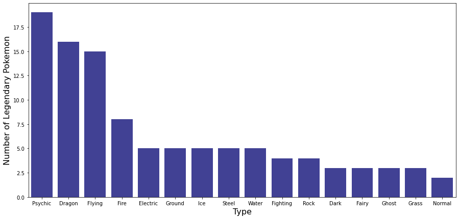
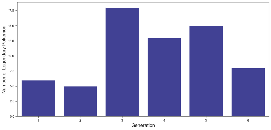
The table and graph above show the number of legendary Pokemon for each type. While most types have fewer than 5 legendary Pokemon, Psychic, Dragon, and Flying Pokemon have more than 15 legendary Pokemon each.
sns.pairplot(data = df_pokemon_type_indifference, vars = ["Total", "HP", "Attack", "Defense", "Sp. Atk", "Sp. Def", "Speed"], \
             plot_kws = {'alpha': 0.5}, corner = True, hue = "Legendary")
plt.show()
It can be seen that legendary Pokemon have higher overall abilities compared to other normal Pokemon as above. Therefore, when comparing the abilities of each Pokemon type, I think that the more general characteristics of each type can be grasped by excluding the legendary Pokemon. Therefore, in the comparison of the abilities of each type, the analysis proceeds by excluding the legendary Pokemon.
df_pokemon_type_indifference_non_legend = df_pokemon_type_indifference[df_pokemon_type_indifference.Legendary == False]
Now let’s compare the abilities of each Pokemon type.
plt.figure(figsize = (15, 7))

sns.boxplot(data = df_pokemon_type_indifference_non_legend, x = "Type", y = "Total")
plt.xlabel("Type", fontsize = 16)
plt.ylabel("Total", fontsize = 16)
plt.show()
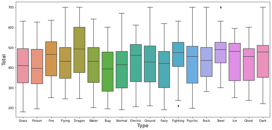
First, comparing the Total, the dragon type seems a bit higher than the other types.
Except for Total, Pokemon’s stats include HP, Attack, Defense, Sp.Atc, Sp.Def, and Speed. Sp.Atc means special attack, Sp.Def means special defense. The higher the Speed, the first to attack. Therefore, among the six detailed stats, Hp, Defense, and Sp.Def are defense-related stats, and attack, Sp.atc, and Speed are attack-related stats. First, let’s take a look at the difference between attack-related stats and defense-related stats for each type.
df_pokemon_type_indifference_non_legend["Total_attack"] = df_pokemon_type_indifference_non_legend["Attack"] \
                                                          + df_pokemon_type_indifference_non_legend["Sp. Atk"] \
                                                          + df_pokemon_type_indifference_non_legend["Speed"]

df_pokemon_type_indifference_non_legend["Total_defense"] = df_pokemon_type_indifference_non_legend["Defense"] \
                                                           + df_pokemon_type_indifference_non_legend["Sp. Def"] \
                                                           + df_pokemon_type_indifference_non_legend["HP"]
sns.set(style="darkgrid")

attack_by_type = df_pokemon_type_indifference_non_legend.groupby("Type").mean()["Total_attack"]
attack_by_type = pd.DataFrame((attack_by_type - np.mean(attack_by_type)) / np.std(attack_by_type)).reset_index()
attack_by_type["color"] = ['red' if x < 0 else 'green' for x in attack_by_type['Total_attack']]
attack_by_type.sort_values('Total_attack', inplace = True)

plt.figure(figsize = (12,12))
plt.hlines(y = attack_by_type.Type, xmin = 0, xmax = attack_by_type.Total_attack)
for x, y, tex in zip(attack_by_type.Total_attack, attack_by_type.Type, attack_by_type.Total_attack):
     t = plt.text(x, y, round(tex, 2),
                  horizontalalignment = 'right' if x < 0 else 'left',
                  verticalalignment = 'center',
                  fontdict = {'color':'red' if x < 0 else 'green', 'size' : 14})

plt.yticks(attack_by_type.Type, attack_by_type.Type, fontsize = 12)
plt.ylabel("Type", fontsize = 16)
plt.xlabel("Total attack ability comparison", fontsize = 16)
plt.xlim(-3, 3)
plt.show()
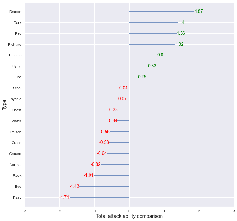
The average of the Total_attack for each type was obtained, and this was standardized using the overall average and variance to compare which type had relatively high or low values. Dragon type showed higher total attack ability compared to other types, and Bug and Fairy showed low total attack ability.
sns.set(style = "darkgrid")

defense_by_type = df_pokemon_type_indifference_non_legend.groupby("Type").mean()["Total_defense"]
defense_by_type = pd.DataFrame((defense_by_type - np.mean(defense_by_type)) / np.std(defense_by_type)).reset_index()
defense_by_type["color"] = ['red' if x < 0 else 'green' for x in defense_by_type['Total_defense']]
defense_by_type.sort_values('Total_defense', inplace = True)

plt.figure(figsize = (12,12))
plt.hlines(y = defense_by_type.Type, xmin = 0, xmax = defense_by_type.Total_defense)
for x, y, tex in zip(defense_by_type.Total_defense, defense_by_type.Type, defense_by_type.Total_defense):
     t = plt.text(x, y, round(tex, 2),
                  horizontalalignment = 'right' if x < 0 else 'left',
                  verticalalignment = 'center',
                  fontdict = {'color':'red' if x < 0 else 'green', 'size' : 14})

plt.yticks(defense_by_type.Type, defense_by_type.Type, fontsize = 12)
plt.ylabel("Type", fontsize = 16)
plt.xlabel("Total defense ability comparison", fontsize = 16)
plt.xlim(-3, 3)
plt.show()
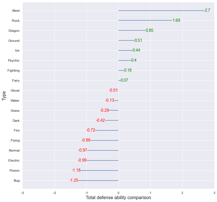
The average of the Total_defense for each type was obtained, and this was standardized using the overall average and variance to compare which type had relatively high or low values. Steel, Rock type showed higher total defense ability compared to other types, and Bug and Poison showed low total defense ability. The Dragon had the highest total attack stat, and the total defense stat was also higher than other types. Due to this, the total ability value that was first seen through the boxplot appears higher than other types.
Comparing the overall attack ability and the overall defensive ability together,
- Above-average attack & above-average defense : Dragon, Fighting, Ice
- Above-average attack & below-average defense : Dark, Fire, Electric, Flying
- Below Average Attack & Above Average Defense : Steel, Psychic, Ground, Rock, Fairy
- Below Average Attack & Below Average Defense : Ghost, Water, Poison, Grass, Normal, Bug
Q6. For 15 Points: Explore how the Pokémon in each generation differ from each other?
- Do you think designers of Pokémon tried to address different distributions of ability points in each generation?
sns.set(style = "ticks")
plt.figure(figsize = (15, 7))

# bar plot for value count of each generation
color = "tab:blue"
ax1 = sns.barplot(x = "Generation", y = "Count", color = color, alpha = 0.5, \
                  data = df_pokemon.Generation.value_counts().reset_index().rename(columns = {"index" : "Generation", "Generation" : "Count"}))
ax1.set_xlabel("Generation", fontsize = 16)
ax1.set_ylabel("Number of Pokemon", color = color, fontsize = 16)

# line plot for number of Type1 of each generation
ax2 = ax1.twinx()
color = "tab:green"
ax2 = sns.lineplot(data = df_pokemon_type_indifference.groupby("Generation")["Type"].nunique().values, color = color, linewidth = 3, alpha = 0.5)
ax2.set_ylabel("Number of distinct type", color = color, fontsize = 16)
plt.yticks([18])

plt.show()
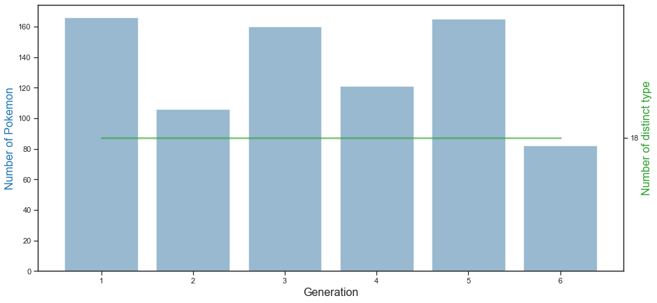
n the graph above, the blue bar graph shows the number of Pokémon per generation, and the green line graph shows the number of distinct types per generation. 1st generation Pokemon has the most, followed by 3rd and 5th generation Pokemon. Generation 6 Pokemon is the smallest with about 80. Also, it can be seen that 18 types of Pokemon exist in all of the 1st to 6th generations.
Next, let’s look at the number of Pokemon of each type by each generation.
generation_type = pd.DataFrame(columns = ["generation", "type"])
for i in range(1, 7):
    temp = pd.DataFrame()
    temp = pd.DataFrame(pd.concat([df_pokemon[df_pokemon["Generation"] == i]["Type 1"], df_pokemon[df_pokemon["Generation"] == i]["Type 2"]],
                        ignore_index = True)).rename(columns = {0 : "type"})
    temp["generation"] = i
    generation_type = pd.concat([generation_type, temp])

generation_type["values"] = 0 # just dummy column for counting in pivot_table function
generation_type.pivot_table(index = "generation", columns = "type", values = "values", aggfunc='count')
| type | Bug | Dark | Dragon | Electric | Fairy | Fighting | Fire | Flying | Ghost | Grass | Ground | Ice | Normal | Poison | Psychic | Rock | Steel | Water |
|---|---|---|---|---|---|---|---|---|---|---|---|---|---|---|---|---|---|---|
| generation | ||||||||||||||||||
| 1 | 14 | 1 | 4 | 9 | 5 | 9 | 14 | 23 | 4 | 15 | 14 | 5 | 24 | 36 | 18 | 12 | 2 | 35 |
| 2 | 12 | 8 | 2 | 9 | 8 | 4 | 11 | 19 | 1 | 10 | 11 | 5 | 15 | 4 | 10 | 8 | 6 | 18 |
| 3 | 14 | 13 | 15 | 5 | 8 | 9 | 9 | 14 | 8 | 18 | 16 | 7 | 18 | 5 | 28 | 12 | 12 | 31 |
| 4 | 11 | 7 | 8 | 12 | 2 | 10 | 6 | 16 | 9 | 17 | 12 | 8 | 18 | 8 | 10 | 7 | 12 | 15 |
| 5 | 18 | 16 | 12 | 12 | 3 | 17 | 16 | 21 | 9 | 20 | 12 | 9 | 19 | 7 | 16 | 10 | 12 | 18 |
| 6 | 3 | 6 | 9 | 3 | 14 | 4 | 8 | 8 | 15 | 15 | 2 | 4 | 8 | 2 | 8 | 9 | 5 | 9 |
plt.figure(figsize = (15, 7))
sns.heatmap(generation_type.pivot_table(index = "generation", columns = "type", values = "values", aggfunc='count'), \
            annot = True, linewidths = .5, cmap="Blues")
plt.xlabel("Type", fontsize = 16)
plt.ylabel("Generation", fontsize = 16)
plt.show()
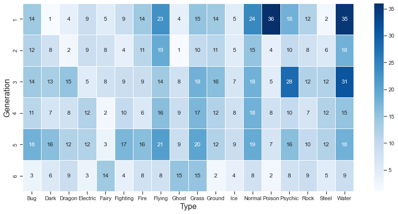
Looking at the number of Pokémon belonging to each type by generation, it can be seen that the Flying, Grass, and Normal types are evenly distributed across generations 1 to 6. On the other hand, most of the Poison type Pokemon are distributed in the first generation.
plt.figure(figsize = (15, 7))
sns.barplot(x = "Generation", y = "Count", color = "darkblue", alpha = 0.8, \
            data = df_pokemon[df_pokemon.Legendary == True] \
                   .groupby(["Generation", "Legendary"]).count().Name.sort_values(ascending = False) \
                   .reset_index().rename(columns = {"Name" : "Count"}))
plt.xlabel("Generation", fontsize = 16)
plt.ylabel("Number of Legendary Pokemon", fontsize = 16)
plt.show()
The graph above shows the number of legendary Pokemon per generation. The number of legendary Pokemon was the lowest in Generations 1 and 2, then more than doubled in Generations 3, 4, and 5, and decreased in the 6th generation, conversely.
When comparing abilities by generation, for the same reason as when comparing abilities by type, the analysis proceeds by excluding legendary Pokemon.
df_pokemon_non_legend = df_pokemon[df_pokemon.Legendary == False]
df_pokemon_non_legend["Total_attack"] = df_pokemon_non_legend["Attack"] \
                                        + df_pokemon_non_legend["Sp. Atk"] \
                                        + df_pokemon_non_legend["Speed"]

df_pokemon_non_legend["Total_defense"] = df_pokemon_non_legend["Defense"] \
                                         + df_pokemon_non_legend["Sp. Def"] \
                                         + df_pokemon_non_legend["HP"]
column_list = ["Total", "Total_attack", "Total_defense"]

fig, axes = plt.subplots(1, 3, figsize = (30,10))

for i, column in enumerate(column_list):
    sns.boxplot(ax = axes[i%3], x = "Generation", y = column, data = df_pokemon_non_legend)
    axes[i%3].set_xlabel("Generation", fontsize = 16)
    axes[i%3].set_ylabel(column, fontsize = 16)
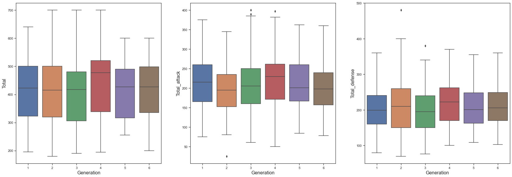
As with the analysis by Type, the Tota_attack column was created by combining Attack, Sp.Atk, and Speed, and the Total_defense column was created by combining Defense, Sp.Def, and HP. Afterwards, Total, Total_attack, and Total_defense were compared by Generation. Compared to other generations, the 4th Generation tends to have higher Total_attack and Total_defense abilities, so it seems that the 4th Generation has the highest Total. To check this more precisely, let’s proceed with anova analysis.
lm_total = smf.ols("Total ~ Generation", data = df_pokemon_non_legend)
lm_total_res = lm_total.fit()
print(lm_total_res.summary())
                            OLS Regression Results
==============================================================================
Dep. Variable:                  Total   R-squared:                       0.000
Model:                            OLS   Adj. R-squared:                 -0.001
Method:                 Least Squares   F-statistic:                    0.1754
Date:                Tue, 15 Feb 2022   Prob (F-statistic):              0.675
Time:                        14:38:35   Log-Likelihood:                -4475.2
No. Observations:                 735   AIC:                             8954.
Df Residuals:                     733   BIC:                             8964.
Df Model:                           1
Covariance Type:            nonrobust
==============================================================================
                 coef    std err          t      P>|t|      [0.025      0.975]
------------------------------------------------------------------------------
Intercept    413.9727      8.684     47.673      0.000     396.925     431.020
Generation     0.9868      2.356      0.419      0.675      -3.639       5.612
==============================================================================
Omnibus:                       46.635   Durbin-Watson:                   2.123
Prob(Omnibus):                  0.000   Jarque-Bera (JB):               17.358
Skew:                          -0.030   Prob(JB):                     0.000170
Kurtosis:                       2.250   Cond. No.                         8.60
==============================================================================

Notes:
[1] Standard Errors assume that the covariance matrix of the errors is correctly specified.
When anova analysis is performed, the F-statistic probability is very high at 0.67. This means that the null hypothesis that there is no significant difference between Generations cannot be rejected, so it can be seen that there is no statistical difference in Total between generations.
tukeyhsd_total = pairwise_tukeyhsd(df_pokemon_non_legend["Total"], df_pokemon_non_legend["Generation"])
tukeyhsd_total.summary()
| group1 | group2 | meandiff | p-adj | lower | upper | reject |
|---|---|---|---|---|---|---|
| 1 | 2 | -9.6467 | 0.9 | -48.3976 | 29.1041 | False |
| 1 | 3 | -8.6761 | 0.9 | -43.8306 | 26.4784 | False |
| 1 | 4 | 19.9359 | 0.6427 | -18.0373 | 57.9091 | False |
| 1 | 5 | -1.3238 | 0.9 | -35.978 | 33.3305 | False |
| 1 | 6 | -3.8492 | 0.9 | -46.7152 | 39.0169 | False |
| 2 | 3 | 0.9706 | 0.9 | -38.7193 | 40.6605 | False |
| 2 | 4 | 29.5826 | 0.3419 | -12.6242 | 71.7894 | False |
| 2 | 5 | 8.323 | 0.9 | -30.9245 | 47.5705 | False |
| 2 | 6 | 5.7976 | 0.9 | -40.8602 | 52.4554 | False |
| 3 | 4 | 28.612 | 0.2885 | -10.319 | 67.543 | False |
| 3 | 5 | 7.3524 | 0.9 | -28.3488 | 43.0536 | False |
| 3 | 6 | 4.827 | 0.9 | -38.8898 | 48.5438 | False |
| 4 | 5 | -21.2596 | 0.5975 | -59.7395 | 17.2203 | False |
| 4 | 6 | -23.785 | 0.6561 | -69.799 | 22.2289 | False |
| 5 | 6 | -2.5254 | 0.9 | -45.841 | 40.7902 | False |
The above shows the turkeyhsd table for Total between generations. When the reject column is true, it can be interpreted that there is a statistically significant difference between the two groups. However, as can be seen from the table above, there is no pair with a significant difference in Total between generations.
lm_total_attack = smf.ols("Total_attack ~ Generation", data = df_pokemon_non_legend)
lm_total_attack_res = lm_total_attack.fit()
print(lm_total_attack_res.summary())
                            OLS Regression Results
==============================================================================
Dep. Variable:           Total_attack   R-squared:                       0.000
Model:                            OLS   Adj. R-squared:                 -0.001
Method:                 Least Squares   F-statistic:                   0.03249
Date:                Tue, 15 Feb 2022   Prob (F-statistic):              0.857
Time:                        14:42:14   Log-Likelihood:                -4105.9
No. Observations:                 735   AIC:                             8216.
Df Residuals:                     733   BIC:                             8225.
Df Model:                           1
Covariance Type:            nonrobust
==============================================================================
                 coef    std err          t      P>|t|      [0.025      0.975]
------------------------------------------------------------------------------
Intercept    210.4234      5.254     40.053      0.000     200.109     220.737
Generation    -0.2569      1.425     -0.180      0.857      -3.055       2.542
==============================================================================
Omnibus:                        7.219   Durbin-Watson:                   1.953
Prob(Omnibus):                  0.027   Jarque-Bera (JB):                7.081
Skew:                           0.210   Prob(JB):                       0.0290
Kurtosis:                       2.767   Cond. No.                         8.60
==============================================================================

Notes:
[1] Standard Errors assume that the covariance matrix of the errors is correctly specified.
tukeyhsd_total_attack = pairwise_tukeyhsd(df_pokemon_non_legend["Total_attack"], df_pokemon_non_legend["Generation"])
tukeyhsd_total_attack.summary()
| group1 | group2 | meandiff | p-adj | lower | upper | reject |
|---|---|---|---|---|---|---|
| 1 | 2 | -20.3667 | 0.1282 | -43.7456 | 3.0121 | False |
| 1 | 3 | -6.365 | 0.9 | -27.5741 | 14.8442 | False |
| 1 | 4 | 3.7588 | 0.9 | -19.1509 | 26.6685 | False |
| 1 | 5 | -4.9142 | 0.9 | -25.8215 | 15.9932 | False |
| 1 | 6 | -12.2064 | 0.73 | -38.068 | 13.6552 | False |
| 2 | 3 | 14.0017 | 0.5444 | -9.9436 | 37.9471 | False |
| 2 | 4 | 24.1255 | 0.0752 | -1.3383 | 49.5894 | False |
| 2 | 5 | 15.4525 | 0.427 | -8.226 | 39.131 | False |
| 2 | 6 | 8.1603 | 0.9 | -19.9889 | 36.3095 | False |
| 3 | 4 | 10.1238 | 0.7975 | -13.3638 | 33.6113 | False |
| 3 | 5 | 1.4508 | 0.9 | -20.0882 | 22.9898 | False |
| 3 | 6 | -5.8415 | 0.9 | -32.2163 | 20.5334 | False |
| 4 | 5 | -8.673 | 0.8921 | -31.8883 | 14.5424 | False |
| 4 | 6 | -15.9652 | 0.5602 | -43.726 | 11.7956 | False |
| 5 | 6 | -7.2923 | 0.9 | -33.4251 | 18.8406 | False |
The same goes for Total_attack ability. There is no statistically significant difference in Total_attack between generations.
lm_total_defense = smf.ols("Total_defense ~ Generation", data = df_pokemon_non_legend)
lm_total_defense_res = lm_total_defense.fit()
print(lm_total_defense_res.summary())
                            OLS Regression Results
==============================================================================
Dep. Variable:          Total_defense   R-squared:                       0.001
Model:                            OLS   Adj. R-squared:                 -0.000
Method:                 Least Squares   F-statistic:                    0.8683
Date:                Tue, 15 Feb 2022   Prob (F-statistic):              0.352
Time:                        14:43:28   Log-Likelihood:                -4057.5
No. Observations:                 735   AIC:                             8119.
Df Residuals:                     733   BIC:                             8128.
Df Model:                           1
Covariance Type:            nonrobust
==============================================================================
                 coef    std err          t      P>|t|      [0.025      0.975]
------------------------------------------------------------------------------
Intercept    203.5493      4.919     41.378      0.000     193.892     213.207
Generation     1.2437      1.335      0.932      0.352      -1.377       3.864
==============================================================================
Omnibus:                       15.901   Durbin-Watson:                   1.958
Prob(Omnibus):                  0.000   Jarque-Bera (JB):               16.396
Skew:                           0.363   Prob(JB):                     0.000275
Kurtosis:                       3.095   Cond. No.                         8.60
==============================================================================

Notes:
[1] Standard Errors assume that the covariance matrix of the errors is correctly specified.
tukeyhsd_total_defense = pairwise_tukeyhsd(df_pokemon_non_legend["Total_defense"], df_pokemon_non_legend["Generation"])
tukeyhsd_total_defense.summary()
| group1 | group2 | meandiff | p-adj | lower | upper | reject |
|---|---|---|---|---|---|---|
| 1 | 2 | 10.72 | 0.7022 | -11.2058 | 32.6458 | False |
| 1 | 3 | -2.3112 | 0.9 | -22.2021 | 17.5798 | False |
| 1 | 4 | 16.1771 | 0.2622 | -5.3087 | 37.6629 | False |
| 1 | 5 | 3.5904 | 0.9 | -16.0175 | 23.1983 | False |
| 1 | 6 | 8.3573 | 0.9 | -15.897 | 32.6115 | False |
| 2 | 3 | -13.0312 | 0.5517 | -35.4883 | 9.426 | False |
| 2 | 4 | 5.4571 | 0.9 | -18.4242 | 29.3383 | False |
| 2 | 5 | -7.1296 | 0.9 | -29.3364 | 15.0773 | False |
| 2 | 6 | -2.3627 | 0.9 | -28.7624 | 24.037 | False |
| 3 | 4 | 18.4883 | 0.1582 | -3.5395 | 40.516 | False |
| 3 | 5 | 5.9016 | 0.9 | -14.2987 | 26.1019 | False |
| 3 | 6 | 10.6684 | 0.797 | -14.0672 | 35.4041 | False |
| 4 | 5 | -12.5867 | 0.5553 | -34.3592 | 9.1859 | False |
| 4 | 6 | -7.8198 | 0.9 | -33.8552 | 18.2156 | False |
| 5 | 6 | 4.7668 | 0.9 | -19.7418 | 29.2755 | False |
The same goes for Total_defense. There is no statistically significant difference in Total_defense between generations.
When comparing the Total, Total_attack, and Total_defense by generation, there was no statistically significant difference by generation. Next, let’s compare the detailed 6 abilities.
column_list = ["HP", "Attack", "Defense", "Sp. Atk", "Sp. Def", "Speed"]

fig, axes = plt.subplots(2, 3, figsize = (20,10))

for i, column in enumerate(column_list):
    sns.boxplot(ax = axes[i//3 ,i%3], x = "Generation", y = column, data = df_pokemon_non_legend)
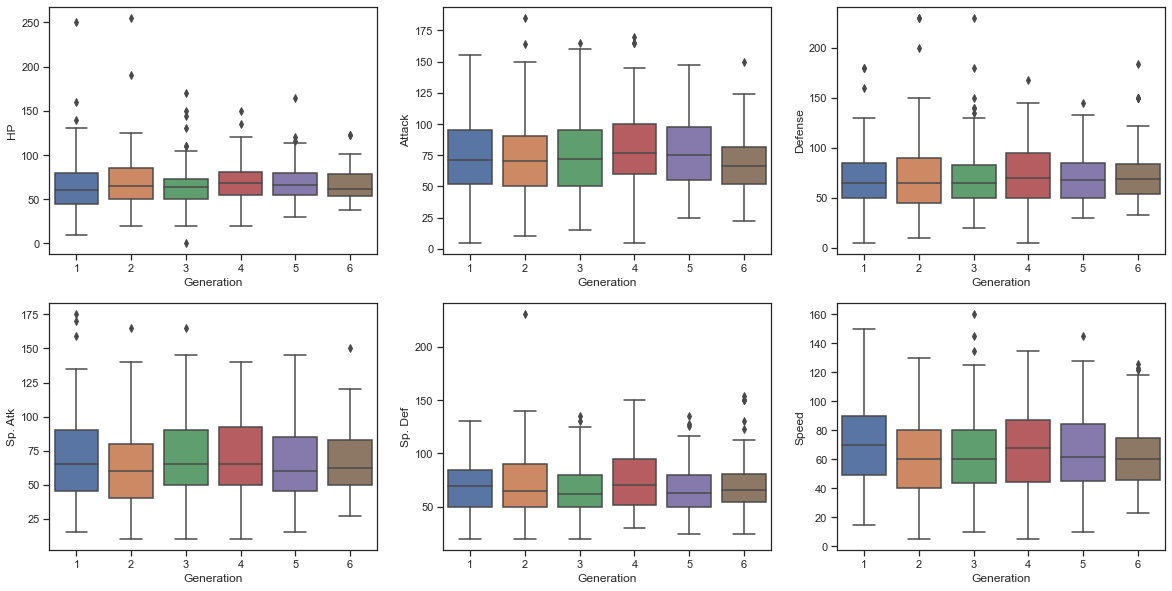
When comparing other detailed abilities, there was little difference by generation. Therefore, it can be seen that there is no significant difference in the abilities of Pokemon by generation.
Next, let’s check if there is a distributional difference even if there is no numerical difference in ability values.
plt.figure(figsize = (20, 20))

g = sns.pairplot(data = df_pokemon_non_legend, vars = ["Total", "Total_attack", "Total_defense"], \
                 plot_kws = {'alpha': 0.5}, hue = "Generation", palette = 'Dark2')
g.map_lower(sns.kdeplot, levels=4, color=".2")
plt.show()
<Figure size 1440x1440 with 0 Axes>
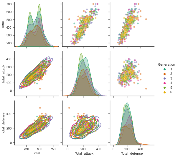
First, let’s compare the distribution of Total, Total_attack, and Total_defense ability by generation. There are 6 generations, so it is difficult to compare, but if you look at the histogram in diagnor, you can see that there is almost no difference in the histogram for each generation.
plt.figure(figsize = (20, 20))

g = sns.pairplot(data = df_pokemon_non_legend, vars = ["Attack", "Sp. Atk", "Speed", "Defense", "Sp. Def", "HP"], \
                 plot_kws = {'alpha': 0.5}, hue = "Generation", palette = 'Dark2')
g.map_lower(sns.kdeplot, levels=4, color=".2")
plt.show()
<Figure size 1440x1440 with 0 Axes>
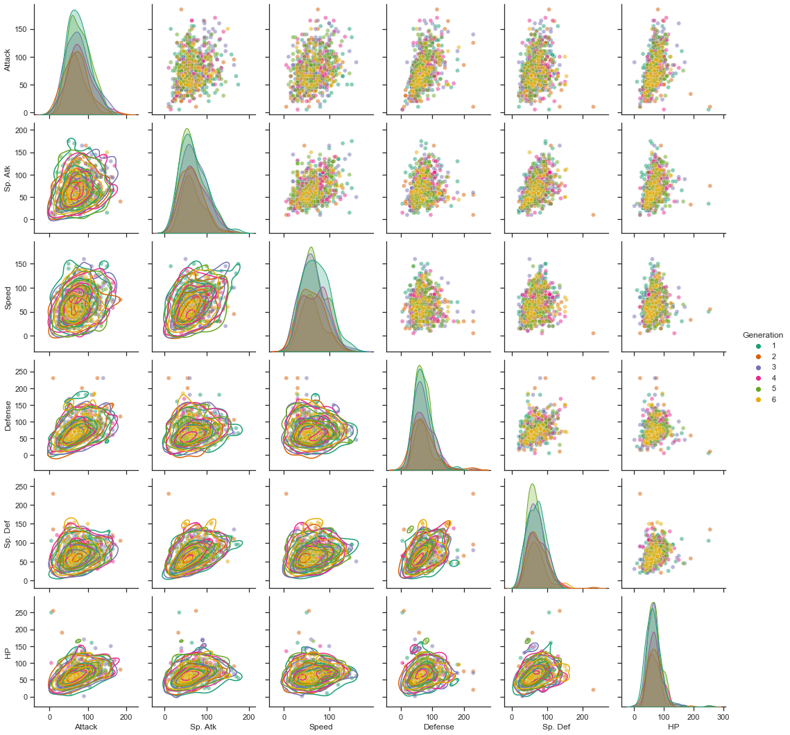
Next, even if we compare the numerical values of more detailed ability values, it is difficult to confirm the difference in the distribution by generation.
In other words, although the number of legend Pokemon and the distribution of Pokemon types are different for each generation, there is no difference in the distribution of detailed stats or numerical differences.